
Logo research: LogoPond.com
Logo design which was made for Bar/ Restaurant in New York this is client based work, using tags by, fresh, modern, typographic letters. I chose this pieces because I like the transformation of the curve with the relation to the shapes I have been using for my work. I love the colour scheme due to it being my favourite colour also the use of alignment leading and also kerning of this type.
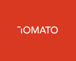
I also like this design which was produced from a artworker ( Production Artist) for this persons friend called Tom I like how he has used negative shapes between the logo to still make sense and understand what the letter ‘T’ means even thought it isn’t formed properly I like the background colour and the layer way of using contrasting colours red over white.

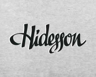
This type also appeals to me because I like the font and the swirls and shape within this piece this piece is produced by a print company for client work, I like the alignment and space between this type the movement within the shape is also spectacular!
This has been produced by Graphic Design Studio for a client I like the shape of this which relates to my work for my inspirations for Si Scott for this piece of work.
