By Loren McDonald, Art & Design, Hull College (Park Street).
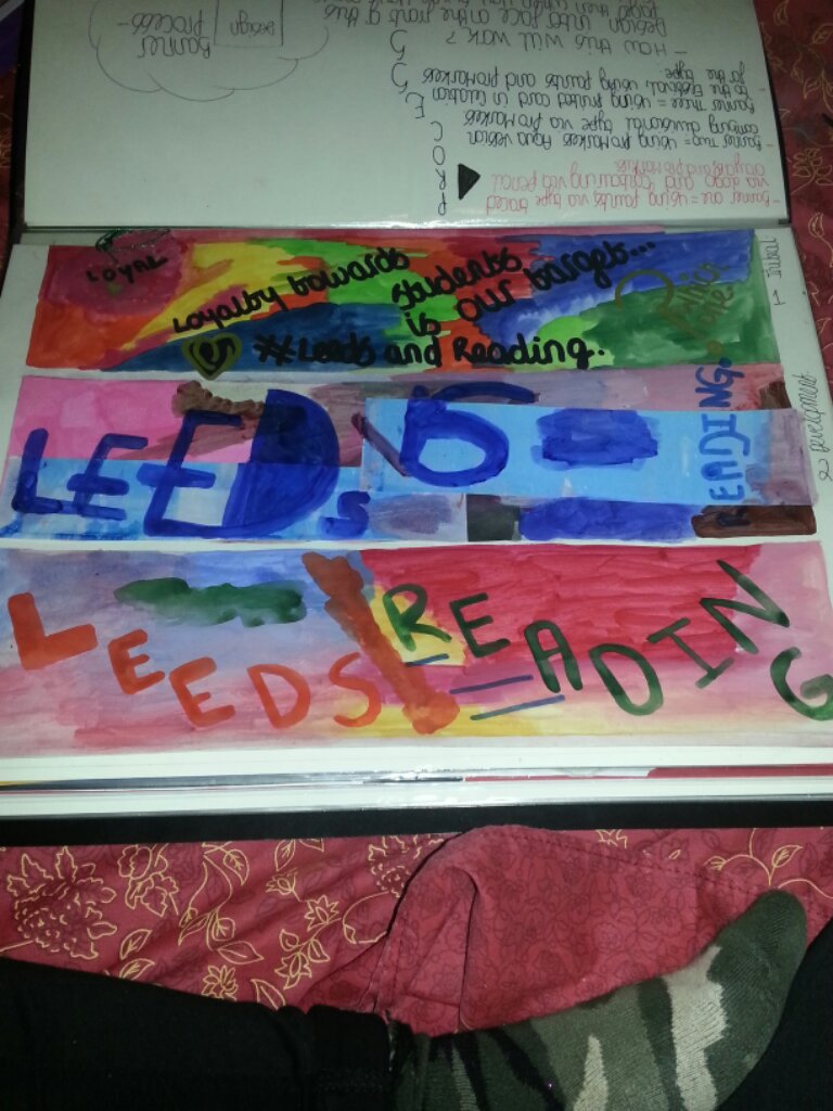
Leeds and Reading Festivals are two annual music festivals which take part every year, in Leeds and Reading United Kingdom. These events take place during the Friday, Saturday and Sunday of the August Bank Holidays, The Reading Festival is set at Little John’s Farm on Richfield Avenue in central Reading. The Leeds event is held at Bramham Park, near Wetherby campsites are available and also sites and tickets include camping but day tickets are also sold for these events with the dates of 24-26th of August. Leeds and Reading Festival stand for music and socialising and generally having a good time aimed at Students but vary in music taste so the age group can vary. Music genres can vary from the line ups which are involved from Rock, Alternative, Indie, Rap, Ska, Folk etc but the biggest part played in Leeds and Reading Festivals is NME (First for music news) the Mobile, Radio, Video, Magazine and Online Music news introducing various genres but also in collision with Twitter and Facebook and Kerrang Magazine, Radio, Video, Magazine and Online news on Music are also taking a big part in the Leeds and Reading Festival! The competitors will also show high value on this and it will be considered in my work and also design values. For my outcome of design my target audience is going to surround students as I have chosen brief one which shows student loyalty and and the thrive for student music. As I am a student I can tell you that my life revolves around Music and it gets me through hard days which is always good! I have never been to Leeds and Reading Festival yet but I would like to sometime go in the future because the atmosphere seems amazing as from seeing my favourite band The Maccabees on television when it was on last year also The Cure! Condisering layout, fonts, advertising, what people are interested in and take interest to and how this would ptomote. Leeds and Reading Festival operate providing music fanatics with there favourite music, singers and bands and also providing cmping areas and also beverages and drinks but these will come at some cost of course to earn profit. Leeds and Reading Festival create the atmosphere which music fanatics crave and this will bring profit due to the musical experience there are other festivals of course but if I was to spend my money I would spend it on going to Leeds and Reading Festival just because the music is out of this world! Festival Expansion which includes the stages of The Phoenix Festival and also The Temple Newsam in Leeds where the V Festival was held in 1997 and also 1998. This has expanded highly since 1997 and 1998 from the value for today 2013 and from 2010. To make this brief function online and offline I will be in the production of creating a Twitter Feeds counting down to my own continuous design to this assignment and also creating various poster designs to show I have considered it being offline, Digitally and Traditionally also creating side advertisments. This will be produced by development and understanding of developments until I get to the final idea even now I know how this will be created and set out but it’s a matter of showing various ways of producing this design and promotion towards this Festival and making it appropiate via age groups etc. The Festivals are run by Festival Republic and which was divested from the Mean Fiddler Music Group for promotional purposes during 1998 and 2007 they where known as Carling Weekend. In the 1970’s the line up consisted of Progressive Rock, Blues and Heavy Metal line-ups, the festival did attempt to provide both traditional and punk and rock with new punk bands leading between clashes between two sets of fans. The Ramones played the following year and it became known for focusing on heavy metal and rock acts. In 2005, the festival spawned the Reading Fringe Festival which is much similar to Edinburgh Fringe Festival which involves, theatre, music, film, comedy and art, from the 11th to the 14th of July this is held! turned in to the hub of theatrical entertainment for range of expriences. The Edinburgh Fringe Festival runs 2nd to the 26th of August showing, Cabaret, Children’s shows, Dancing acts, Exhibitions, Comedy, Music,Musical Opera, and Theatre. Also showing the experience of of various events, this is similar taking place is Scotland’s capital The Fringe is a unjuried Festival which means performances may participate, with no selection committee. This means The Fringe has often showcasred exprimental works and findings to a more conservative arts festival and located primarily on the Royal Mile.
Leeds and Reading Festival Research: Leeds and Reading Festival have highlights on BBC Radio One, BBC Radio 1Xtra, BBC Introducing, BBC Three, Vodafone, NME, See Tickets, TUBORG, GAYMERS, Relentless, Pepsi Max Sponsors. Pre sale of the Leeds and Reading Festival started November 30th at 9am, They will be selling tickets at 2012 prices and setting up a new scheme £50 up front where you will be able to hold your place. You will then pay the finalization of the ticket in March next year. The function for this assignment is trend and loyalty and how that operates forwarding to promotion and how to make this student friendly so they will return to this festival. I will be focusing on both Reading and Leeds festival just to make this clear.
History of Reading Festival: Reading Festival started in 1989 and is still going today in 2013 and it went through different music variations from each year going through to the old indie rock stages to the actual indie pop/electro stages from today’s music such as The Charlatans from Nirvana and to now Friendly Fires and Bombay Bicycle Club just the pure difference of the music taste from 1991-1992 and then 2011 music tastes are still alive even to this day and also from 1991-1992 and generations and years before and after this. I would be interested in attending these festivals just because of the music genres and atmosphere must be amazing! Reading Festival since (1971) various as national Jazz Festival, Reading Festival is held at Little John’s Farm on Richfield Avenue near Caversham Bridge, between Leeds and Reading Festival: in the twin site depending on the genres of era between rock, alternative, indie, punk, metal are tended to dominate. In 2011 the Reading site had the capacity of 87,000 and the Leeds site had the capacity of 75,000 this was a increase of several thousand on previous years. For promotional purposes during the years of 1998-2007 they where known as the Carling Weekend Reading and Leeds.
Stages: The festival has the main stages of these: Main Stage: Main rock, indie and alternative and metal acts, NME Radio Stage 1, less well known acts building up upon the alternative headline. Festival Republic (formely known as the Carling Stage) acts with less popular appeal and breakthrough acts, Lock Up Stage: Underground punk and hardcore acts unlike the usual one day event this event was on demand and was taken up to two days, Dance tent: Dance music events on the day that Lock Up does not run. Alternative Tent: Comedy and Cabaret acts and also DJ’s BBC Introducing Stage/ Typically unsigned not well known acts. The Reading Festival originates from the National Jazz Festival (Which was concieved by Harold Pendleton (Founder of the Marquee Club in London) and was held at Richmond Athletic Ground in 1961, This festival took inspiration from events held in America. Throughout it’s first decade changed names and move around site several times. Being held at Windsor Racecourse, Kempton Park, Plumpton. before reaching it’s permanant home in 1971 at Reading.
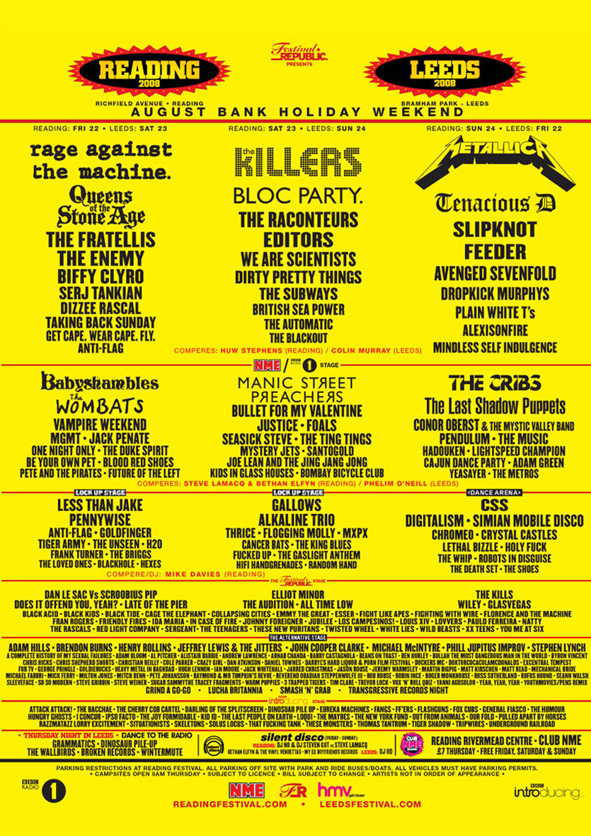
Leeds Festival History: The first first festival at the site was at called Temple Newsam grounds including Red Hot Chilli Peppers and Blur in 1991, the event is ‘twinned’ with the Reading Festival so that the same line-up appearing at both venues other the space of three days. A weekend ticket in 1999 would cost you £80 for the Leeds event. Festival Headliners: 99: Charlatans, Blur, Red Hot Chilli Peppers 00: Oasis, Pulp, Stereophonics 01: Travis, Manic Street Preachers, Eminem 02: The Strokes, Foo Fighters, Guns ‘n’ Roses 03: Linkin Park, Blur, Metallica 04: The Darkness, The White Stripes,Green Day 05: Pixies, Foo Fighters, Iron Maiden 06: Franz Ferdinand, Muse, Pearl Jam 07: Razorlight, Red Hot Chilli Peppers, The Smashing Pumpkins 08: Rage Against the Machine, The Killers, Metallica 09: Kings of Leon, Artic Monkeys, Radiohead 10: Arcade Fire, blink-182, Guns ‘n’ Roses. First Headliner announced is Eminem and the Headliners already announced for the 2013 acts are Deftones, Alt-J, Subfocus Live, Boy Better Know, (Ft. Wiley, Skepta,JME. Rumours of Green Day, Blur, Mumford & Sons, Black Sabbath, The Prodigy, and Biffy Clyro! Eminems appearance will mark twelve years until he last headlined which he famously finished his set and duet with controversial rocker Marilyn Manson. The 40 year old rap artist exploded on to the scene and sold more then 100 million records worldwide 1999 was when he started on the music scene. He’s best known for his songs such as: The Real Slim Shady, Lose Yourself, Stan, which features Dido on vocals. The most famous news in the Leeds Festival History is when Kurt Cobain showed up in a Wheelchair and took the stage, pushed by Journalist Everett True, parodying speculations about his mental health. He was wearing a medicalgown and went to join the rest of the band and play assortment of their songs old and new! Over the next few years the popularity of the festival begain to to expand and grow with outdoor festivals which increased, Britpop and Indie continued to dominate with rock. Also Rap acts like Ice Cube began to appear. Bottling offstage acts (being forced off the stage by a barrage of audience-thrown bottles and cans) unpopular bands have been bottled off the stage throughout the festival history. 29th November 2012 organisers announced the initial line up today at midday, organisers confirm additional two or three stages on the 3rd of November 2012, Organisers also reveal the first sale of the Leeds tickets on sale for 2013 on the 3rd of Novemer. The presale will feature a limited number of Leeds 2013 weekend tickets available for a short time held at 2012 prices! Buy your Leeds and Reading Festival tickets for a £50 deposit!
Twitter feeds: Leeds and Reading festival last chance ticket was confirmed on Twitter and this was on the 21st December same price held at £50!Also announcing a Christmas giveaway of band merch and DVDS also signed posters giveaways confirmed on the 17th December. Vodafone and VIP customers can now buy Reading and Leeds Festival tickets when registering, confirmed on the 28th of Novemer. Annoucing the first acts from the week after 23rd of Novemer for the Leeds and Reading Festival. Wiley confirmed that he will be at Leeds Festival on the 29th of November. Festival boss Melvin Benn has been planning these exciting changes and additions to the festivals over the past year to create new change and new excitment, refining and expanding their propositions for the fans focusing on them. With the first wave of bands and acts announced across the festival Reading and Leeds Festival 2013 are already shaping up to be one amazing weekend! with many acts still to come over the NME/Radio 1, Festival Republic and Alternative, Lock Up, BBC Radio 1 Dance, BBC Radio Xtra and BBC Introducing stages also have unconfirmed acts but more acts to come! The gig is also exciting for Alt-J singer Joe whose first festival was Leeds in 2002! The distance between Reading and Leeds festival is about 200-250 miles. Half way between Reading Festival is (Berkshire, UK) Leeds Festival is on Bramham Park near Wetherby, the grounds of a historic house. To keep updated about the line-ups and news and just general info about the acts and bands and festival guide there is a app from 2011 showing directions obviously they may update this to 2013 but who know but you can also check out the Reading and Leeds festival website. Cost of a ticket is £197.50 for the weekend ticket date on Friday 23rd and Sunday 25th August 2013 and this is the confirmed dates for this year.
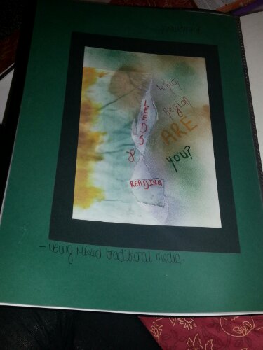
Pitch Document: I have chosen for this assignment the Reading and Leeds Festivals in the process of engaging the target market of students and creating customer loyalty. Although the festivals are for all ages accept for children and depending on music taste. I have chosen this design package just because of the general relation to my music and music taste although I haven’t been but planning to go this year. On my creative outcomes I did find it disappointing that I would have to move away from Fine Art aspects and create this graphically for a professional commercial use but I have a few good ideas on this piece and take upon this, I am going to produce this as a whole new way of advertising such as a take on the Typography and design ideas for a outcome. Advertising a whole new take on the colour theme, layout and maybe a little photography design, it also makes it easier because my favourite bands and singers are attending which makes it reassuring as to what to theme and colourize it too! I will create an advertisement supporting this and using various methods of media to produce my final development outcome which will support this assignment and the way it is making engagement to the audience and ways of the audience. Focusing around the student network of age groups and this is focusing around music taste and reaction to design methods also. I will take on Typography design and also the Hue of design colour and how design is differentiated to socializing and trend and age groups. Focusing on the music importance and methods and introducing this in with the assignment. I think I will focus this more around magazine (NME) because most my favourite bands focus in the NME Magazine which will be a good relation to the music I like and producing this in to advertisement methods. I may focus on other media and methods during the process and development to this assignment. This will have a function of advertising of promotional awareness and to show musical interest towards students also producing loyalty and value towards the assignment. Commercial advertising for music and the media a bit like the NME magazine I may form it in to a magazine or a digital advert I haven’t decided yet. Creating billboards and online elements of adverts like side adverts and Photoshop made Posters for advertising but still using the original logo, Twitter feeds and Facebook feeds counting down to the Festival. Expressing the form, structure and space and how it operates in expectation of this being simple because one thing I do not want to do is create something that is not costumer friendly and will not know how it will process and how to get the messsage of it. I will figure out who to design this in two weeks time and also using the help of Printmaking for design ideas on borders, frames, action buttons etc. I want this to be user and student friendly within the guidelines of Leeds and Reading Festival which will meet that criteria of producing online creations such as Twitter feeds, advertisements then also creating offline productions such as variations of poster ideas between Leeds and Reading and this will be seperate things as the both are seperate events but I am still covering the whole. This will be the outcome for this assignment and also covering some sort of motion interactive idea which I will find out further from Dave it’s not on the brief so I don’t know if I will have to involve something like this in to my work. Designing things not actually making them work which I didn’t get the hang of at first because I thought I had to make this work and set this up it should outline this in the brief. My target audience is aimed at Students and how to gain loyalty towards students to make them come to Leeds Fest and Reading Fest over and over again and also engage more students in to trying it out. but futhermore I am going to also create some sort of loyalty card for if you go for two years you get a money off your third ticket if you go the third year.
Form and Function: BBC Radio 1’s Big Weekend: previously known as ‘One Big Weekend’ and in 2012 known as Radio 1’s Hackney Weekend the biggest free ticketed event in Europe.It is free with last years crowd Capacity of 50,000 people.

This poster promotion design shows the function of it being big bright colourful making people attracted to it and making people want to go to this event, the big bold text shows easy to read and fun to read the clouds look fun and very comic like. The function is to attract people to go to this event but also showing the main event holder which is BBC Radio 1 The graphics include graphics that attract me to research this event and and the form is the shape and space of this poster design/ advertisement which shows attraction to be fun and very exciting making teenage age group attracted!
Glastonbury Festival:

The form of this design is to show the culture of that particular place showing Farming value with the image of cows and also the 40th Anniversary showing how many years it has been on for not similar to Radio 1’s Big Weeked but different in design, similar aspects showing massive text of where it is the font attracting the eye and control of the eye, where it is and how long this event is on for is key information to the customer! Design is advanced and aimed around agriculture and based on where it is because it is held on farm land, and the image connects with this also showing the aspect of culture and this is very different from BBC Radio 1’s Big Weekend with the style, fonts and graphics.
T In The Park: Is a major Scottish Festival held at Strathclyde Park, Lanarkshire and is a music festival and stalls and shops provided and also a funfair. The form of this design is the poster and it shows differences of the bands being show on the posters unlike the Glastonbury and BBC Radio 1’s Big Weekend poster, information showing the last few tickets being sold, also down the side of this poster are Polaroid images which is the expression of memories and events showing happy moments. The Function is the event to promote like everyother poster but to show people would be more attracted to this because the bands are on the poster instead of looking this up via researching because yes! people are lazy and will not do this at all! The function shows advertisment in to this event.

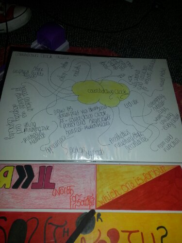
As I want to produce a countdown feed as a Twitter feed as my online criteria to the brief I am now going to research countdown examples to meet this and show advertising examples to explain them through Form and Function.
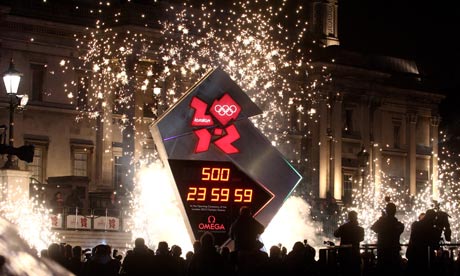
Form of the shape and the design showing the main Olympic Logo to show what this countdown clock is for and how it will be used for the function of counting down to the Olympics 2012. The design is key I like the shape it is different and fun within the design to shape and the material it is made out of, I don’t like the style of how the numbers/time is set out to countdown to the Olympics I would change this for when I am considering my idea to design my own and also my range of posters for Reading and Leeds itself. This will be made with Photography then a digital countdown and the logo which will be shown on this to show what it is for and for event reasons.

This is the Leeds Festival countdown which shows the information of it showing, days, hours, mins and seconds to show the countdown until Leeds Festival I screenshot this from the actual Leeds Festival website but in the background Chevron design as I screenshot this it cut half of it off but the function of this is to show the countdown to Leeds festival to customers who are going or who are thinking of going. The design of this is just basically typed on to the website unlike the way I am going to design this in terms of formation and forms such as Photography with a border then a digital countdown below this Photography which shows the interpretation to the Leeds one above but via more detail and design due to focusing on this most this is the online development to my assignment and to also attract new customers with the age group of students and then gain loyalty by designing a new online advertisement to promote the countdown of Leeds Festival. This shows the value of designing something already thought of but in a different way and aspect of creating a countdown clock the form will also be in a different shape and such as font which will be professed in to something different and styled much more differently to the one above and this is good because it’s something new and different which is created new. I will change the number/countdown style.

This advertisement countdown clock is Samsung designed with the function to tell people when the Samsung S3 Mobile Phone comes out giving details and giving Hours, Mins and Seconds with a tagline: “You can take the next step in” This makes consumers anticipate for the next upcoming phone from Samsung. The form for this is the design layout and the technical aspect of this and how it works etc, showing the countdown in a square with circular edges which is effective. With the official Samsung Logo on this which I will produce on to my countdown but the Leeds Festival Logo of course I will make this bright and bouncy and fun to attract Students to this event which I am aiming to to for Brief One which I had chosen for this event also a bold countdown clock to show this. I will then show the offline mode but not actually launch this fully just design this to see if it will launch!

Advertising for website promotion: This shows the actual Leeds Festival website showing the line-up but they will be more during the year until the actual day of the Festival. The form shows the design of this website and the Chevron design also the Typography design showing the main headliner in bold and massive size! The function to this this website shows to show the headlining bands, the countdown which are the key elements and points to the function but also showing hyperlinks to Home, Tickets, News, Information and the 2012 site which is really handy. Also linking with the Reading website which is a good link and attraction towards these Festivals.

This website is the Reading website shows the exact information as the Leeds Festival website due to them being linked and except the form the colour is different but links with the logo colours and also the Chevron is different due to the background being a various colour the Type is coloured differently using the elements and colours of the main Leeds and Reading Festival logo!
![]()
Showing the function of it attracting consumers via the colours and how it links to the main logo, red for Reading yellow for Leeds, red type for Leeds and yellow type for Reading! also showing the same function to the Leeds website because it’s the same website different events.

This is the Glastonbury website showing the same functions but different layout showing hyperlinks and acts down the side well latest news, showing ticket updates and different layout using Photography and graphics to support this. The function is to again promote and to gain more people and capacity at the festival to show popularity. Form is the layout and design showing Agricultural design once again and also promotional design and piece within the actual website! which shows different colours to Leeds and Reading but also no contrasting layout via the two websites just because Glastonbury is just one event.
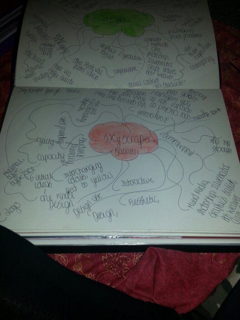
This is a Skyscraper Advertisemeements nt which is used on the side on websites to advertise and promote like for this function is to show the Economic Finance Conference having something to do with money and location of Singapore which is near South East Asia this has the form of a Graphic behind the type and text and shows key information such as dates and and year and what the ad is for and who the ad is about such as key names also contrasting the colour of dark blue to light blue showing opacity on the background.

This is a another example of a Skyscraper design which shows the exterior extent of weather and condtions advising tips for outdoor camping showing the key elements on this ad but also using form on the type and also the images/ icons and layout of this graphic. The Function is to advise and also gives you the option of clicking on a hyperlink which takes you to more information which is very handy and good! also big text to alarm the reader to make you read it the colours also contrast with eachother to show good form and layout to this advertisement! the colour of the white text and icons also stands out to make you look!

On this ad it clearly focuses on Dog food and advertising the form of this advertisement of a image and then the information layout showing eye control going downwards to show form of text but then also showing production of and the function is to support and promote the aspect of Dogs and Dog Food which shows it being aimed at puppies, giving the key information in white colour font. Showing the promotion of and the layout colour goes well with the other colours and contrasts really well the other designs I’d say the one I would look at the most is this one because it involves Puppies and I have a Dog so I can relate to this ad because I like them so this would attract me more.
Free Festivals: Freedom Festival, BBC Radio 1’s Big Weekend, City of London Festival, Edinburgh International Jazz and Blues Festival, Rise: London United Festival, Canary Wharf Jazz Festival, If you win tickets to the Itunes Festival this is free due to not paying, Imperial Wharf Jazz Festival, Festival Too! Monmouth Festival 2013, Coventry Godiva Festival 2012, Stonehenge Festival 2012, Strawberry Fair 2012, Paid for Festivals: Leeds and Reading Festival, V Festival, Glastonbury, Sonisphere Festival, Download Festival, Itunes Festival paying ticket, Onefest, Retro-Trax Festival, Lakefest, Somerset Chilli Festival, Glastonwick, Field Day Festival, Evolution Festival, Love Saves the Day Festival, Rock Ness Festival, Parklife, Beach Break Live, Lovebox Festival, Isle of Wight Festival, Leefest, Blissfields Festival, Cornbury Festival, Lemonfest, Lounge On the Farm, T In the Park, Latitude Festival, Splendour Festival, Camp Bestival, Farmfest, Global Gathering, Kendal Calling Festival, Relentless Boardmasters, Beacons Festival, Creamfields Festival, Solfest, End of the Road Festival, Shakedown Festival, Bristol acoustic Music Festival, London Popfest 2013.
Practitioners and Competiton: The main competition for Leeds and Reading Festival is the main festivals such as: Glastonbury Festival which is located at Worthy Farm, Pilton UK, Sonisphere Festival, France 08-09 June 2013 located at Amneville and also located in Italy Fiera Milano live RHO Milan on 08 June 2013. Also showing competition between Download Festival which is located in: 14th-16th June 2013, Donington Park, Itunes Festival, London, V Festival, Hylands Park, Chelmsford,and Weston Park Staffordshire. Also more competition from T in the Park located in Scotland. These festivals are the main competiton for Leeds and Reading Festival and the whole popularity and capacity of this.
You can study Music as College course subjects or University Degree but I am going to focus on the real practition for the festivals. Practitoner: Jane W Davidson she is a british Musicologist and also a music coordinator, and also postgraduate studies at the School of Music, University of Western Australia in Perth, Davidson has wrote over a hundred scholary contributions on performance, expressions and therapy and determinants for various artistic abilities. She also a practising musician and also covering duet of expressive movements also the value of music and and also singing identity personal, and the function of music in mental health settings.
The musical performances of the Temple Street musicians in Hong Kong and the process of music theatre directing and the staging of Baroque works. These interests reflect her unsual background in music and psychology and musicology vocal performances and also contemporary dance. Davidson has degrees in music and vocal performances and contemporary dance. Having studied at the University of Newcastle, University of Leeds and the University of London and at the Laval in Quebec, Canada. She has won many prizes and and scholarships including Rotary International Graduate Scholarships.
Jeremy Soue is an American Composer of soundtracks for film and television and video games he has won multiple awards and has been described as the “John Williams of Video games” He has also composed soundtracks for over 60 games and over a dozen of other works over his career. He is best known for his work on: The Elder Scrolls, Guild Wars, Harry Potter these top selling titles, he is from Iwoa Keokuk in America his labels are DirectSong, he became active in 1994 and present. Genres he covers are Orchestral, Classical, and Amient music genres. Born December 19th 1975.
He did several years of personal private study on compositional music he then became an employee at Square in 1994 which is a Japanese video company founded in September 1983 by Masashi Miyamoto the company then merged with Enix to become Square Enix that company is a video game company which produced Anime, Manga which was founded in September 22nd 1975 but they linked in 2003. In 2005 he founded DirectSong a label that publishes digital DRM- free versions of his soundtracks as well as those Classical Composers. Soule’s work has been played in several live concerts such as the Symphonic Game Music Concert in Germany and also the International!
Music Companies and Investigation:SoundCloud is a music comapny which is for creating a simple , democratic sound-sharing platforms embraced by artists and and the users neighbourhood on SoundCloud. More than 10 million users have jumped on SoundClouds mission to “Unmute the web!” I have SoundCloud and I can say it is rather amazing for music! Spotify is also another music company I enjoy listeing to my music on here. This music streaming service is my most favourite of all Facebook’s default partner and gained 3 million paying customers and subscribers worldwide, 20% of it’s active user base!
Last.fm is also a music service which I enjoy listening to and I also have a scrobbler on my laptop which is a desktop mini version of Last.fm which is rather wicked! It users a music recommendations of ‘Audio Scrobbler’ which Last.fm builds a profile of each music users musical taste and then plays through the Recommendations/ Your Neighbourhood and your taste in music! Even having Internet Radio stations for the user’s computer, or many other portable devices, founded in the United Kingdom in 2002 it has claimed 30 million active users in March 2009 this service is free to UK, US and Germany. Users in Canada,Ireland,Australia,New Zealad and Brazil require subscription to use the radio service at €3.00 per month after a 50 track free trial.
Grooveshark is also a music streaming service which I enjoy using also, a subsidiary Escape, Music Group, is an online music streaming service based in the United States, it has a search engine and a streaming service and also like Last.fm a recommendation application. Users can stream and upload music that can be played at that point in time or added to a music playlist and group and played all together also linking other playlists to play all at once after track, after track. As of January 2012, Grooveshark was sued for music violations and copyright by all major companies involved with music! EMI, Warner,Sony,and Universal music where involved in this act.
Pandora Radio is again another Music Streaming Service which is, it plays music based on your feedback of your music taste this is the built Radio service though. Once you have entered a song name or artist name the service then logs this and suggests similar artists to listen to, Pandora also suggests similar tracks which you can accept or reject. This is an automated music service recommendation and service ‘Custodian’ of the Music Genome Project. Used in the United States and Australia and also New Zealand this gives you suggestions from similar songs the user has played and entered by the user, in which the user provided positive or negative feedback on the songs.
Napster is also a music streaming service but it is payed for, and a online music store, and a Rhapsody company branded under a purchased name and trademarks of former free file sharing service of Napster. The company’s name and logo originated from bankruptcy liquidation of the Napster peer-to-peer file trading service. Napster was then purchased by Roxio which is American software creation for in consumer digital media products.Napster was founded in 1999 as a free service until Roxio purchased this music streaming service! Napster was formly headed by Chris Gorog the basic subscription tier, offers unlimited listening for $5–7 per month (£5 per month in the UK). USA members may also purchase DRM-free MP3 downloads at a discount. Napster also offers an MP3 store, a pay-per-track store which does not require a monthly subscription fee.
WE7 is also a free music streaming service! which is with over 6.8 tracks available for streaming in the UK and also Ireland most tracks and albums are also available to purchase from the in-site store which WE7 provides, with content from major record labels! Outside the UK and Ireland are very limited to the content in which they can listen to. Songs have a short audio adverts such as blipverts that play before each song is listened to! This site claims it had 3 million tracks available for streaming at launch, claimed 500 thousand users and 3.5 million tracks in March 2009 claims over 3 million users and 6.8 million tracks. In June 2007 WE7 was acquired by UK retailer Tesco for £10.8 million.
Peter Saville:Peter Saville is a GraphicDesigner and a art director and was born 9th of October 1955 he has designed many record sleeves for Factory Records! Peter Saville was born in Manchester, and attended St Ambrose College he also studied Graphic Design at Manchester Polytechnic then later Manchester Metropolitan University from 1975 to 1978. Saville entered the music scene after meeting Tony Wilson the journalist and also television presenter, whom he approached at a Patti Smith 1978 Saville became a partner in Factory Records and designed album covers for Joy Division, New Order.

This poster design relates to The Leeds and Reading Festival poster with the colour he uses and design and style are very similar. I like this design just beacuse of the heavy graphical technique and also how it uses negative space making you focus on the company in the middle!
This album is my favourite ablum which Peter Saville designed I like it because it looks like she is vommitting glitter which looks rather effective and it brings a contrast in to place with how black and white this image is which makes it look professional, I like how it almosts fits together being tight and so unspacious and a bit cluttered up but it works with type in the corner.

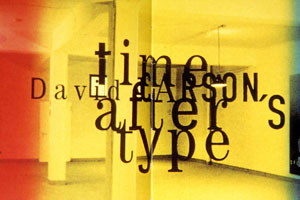
David Carson: David Carson is a American Graphic Designer, best known for his innovative magazine work, and also uses of experimental typography work. He was born in 1954 and he was the art director of the magazine, Ray Gun, Carson was perhaps the most influential Graphic Designer in the 1990’s. His aesthetic has been defind as called Grunge typography era. He was from Corpus Christi in Texas his work is based around text building and layering and making the image connect with the text making you decode parts of his work with eye control. His working is also rather blocky but also showing using negative spaces but also the opposites of this in his work I have chosen this practitioner because his work links with the Leeds and Reading Festival poster layout and the type also does.

This connects with the Leeds poster just beacuse of the colour tone to the background not so much on the type but as you can see it is very choatic and messy and loud and also in your face. The decoding of this design is critical to alignment and also layout this is considered in which it makes no sense yet to David Carson it works and fits what the meaning is and also showing. This is a flyer design and it uses a graphic white images on the background which I like and would take inspiration to!
This design again is focused around how choatic it is and the colour scheme to the photography in the background is also very effective and and shows space within this type bringing the bold type in the center forward and making you focus around this and how it is aligned the David Carson type in the background you have to decode Eye control is key in this design because it is very hard to read because of how off centered it looks and how messy it looks but then again this is how David Carson works and it is effective and is still type.
Cross Cultural references and cultureal influences: A festival or gala is usually a event that celebrates the community and the local culture of that community, this is staged by a local community or organizations in which organise the event standing. The Leeds and Reading festival history focuses on the band genres within the yearly poster designs for each festival, the design of each festival and layout is the branding to the Leeds and Reading Festivals and is the key component within design and culture references to this. Just for examples towards this design to reference the genres: These genres are known as old indie rock and also rock but this comes in to place with a different colour design to show history and culture to leeds in 1991 which shows changes from the design which is a contrast between 2000 to 2012 this shows the same colour themes but a change in the

logo design which has now evolved since 2008-2012 even thought it was the same logo design in 2002-2007 but was known as the Carling Weekend at that point.
This design is much more different from the 1991 to show history and cultural influenctial aspects moving up from bands which takes much impact on the poster design! and it shows technology and graphics moving along. Which shows differences between it being a original rock and indie festival but then emerging Eminem in the 2013 line-up kinda takes it out of the question but in my opinion despite the genre of the festival it shows it moving up in time and creating space for other genre which is also good in terms of creating more culture for fans but also the bands and acts. It shows a total different change in society and also it will in the fan population for 2013 just depending on the main headline because this will produce a lot of cultural references and impact on capacity with various fans wanting to see Eminem. It will show a form of culture just because of the leap.
The message is simple yet seems so complicated basing it on band influence just to look upon the fans and the capacity of this. The design also fits in to this from when it first started to now shows a massive take on culteral influences which has a massive take upon brand identity and how it has developed. Pop culture known as Popular Culture, the entire points of perspective, ideas, attitudes, memes, images, mainstream and culture phenonena and also this was popular in the western culture. History of the definition was coined in the 19th Century! Also connecting about self reference within your prespective. Popular Culture developed from traditional folklore, the urban layer of cultural mainstream is still alive to this day. The folklore element also interacted with the commercial element of cultural identity and people.
But opinions and beliefs between this got clouded and it’s word of mouth became blurred and original identity to culture to Pop Cultural aspects. The stress of Pop Culture became more defined towards then end of the 19th century which then was established during the Interbellum period which is: was a period of history where Europe couldn’t recover from The First World War. This also affect the religious cultural aspects within people and what there beliefs where. When designing and considering brand identity also covering Guidelines and the legal aspects of this is vital to this assignent. Considering copyright to the brand design and the legal requirments which are covered in Info and General Information on the website which cover: 2013 Tickets, Smoking, Age Restrictions and I.D. and Terms and Conditions and also Animals within the festival, also Things you can and can’t bring, Site Map, Looking after your wristband, Lost Property, Opening Times,
Information Board and also Eviction Policy when researching you have to consider this for the legal terms but also the cross culteral reference for fans and new fans which will attend the festival. The festival closes Midday Monday 27th August. ARENA OPENING TIMES: Thursday 23rd August – 5pm [only for weekend ticket holders] Friday 24th August – 11am Saturday 25th August – 11am Sunday 26th August – 11am The basic information to fit within the legal policy. Cultural reference to this will be vital because of different races who will attend the festival so considering this will be vital for culture and the actual festival branding showing this has been considered and acted upon. Cultural references act upon the design process of my outcome because it can not be racial which is wrong anyway but it has to be clean and meet the requirements. Showing depth and consideration in to the possibilities of this which is the cultural form to this piece.
Considering Product/ Promotion and Target Audience: The target audience for any festival is varied obviously not young children, but the age range between Teens and Adults pretty vary. I’m focusing on student loyalty and a target age range of students and the student market and loyalty of this. Considering financial forms for students and ways of promotion. The promotion of Leeds and Reading Festival is Facebook pages, Twitter feeds the websites and also poster designs and apps and news so my idea comes in to place with these considerations when promoting the festival for the student market. Also condisering the Leeds Festival Merch which is products and links with this. Merch on the Leeds website goes back to 2010-2012. Considering form and function, style decoration to my end design to various poster designs and
Finishing methods, I already know that it is going to be Contemporary since I am focusing on technology via the Twitter feeds, cultural and sociable but also the form and fuction of promotion and will be somewhat sustainable, and use of protection, experimenting with mixed media such as CAD, Printmaking, and Traditional methods aiding Illustrator and Photoshop. Fexible, durable, structured or minimal, inviting for student loyalty, temprature though designing methods. Cross culture references such as Urban/rural cultural impact, communities, global context, target market groups, western and none western cultures and other implications, fashion trends and genres and ethical values and environments values. Consider cost and quality control within designing work and promotional value, the environment and also where materials may come from, and health and safety issues which align and meet the requirements to this assignments.
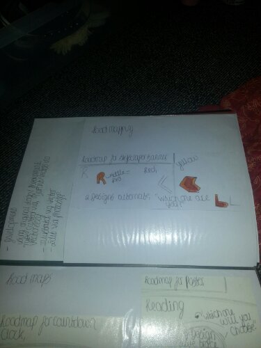
Considering the idea stages of designing work for promotion such as mind mapping and bullet points, considering materials and also restrictions towards the art work and 2nd 3 development stage to get the ideas started off. Also the developing stages for promotion like varied ways of promotion to advertise the student market and loyalty aspects of this and to understand the outcome of my work and to consider the guidelines when coming in to contact with this. I have mentioned this in my pitch document to show promotional ideas via creating various poster designs and twitter feeds somehow connecting the function of socializing and to design the formal aspects but not to function this properly in to something that has motion. The promotional aspect is to promote the brand to a student market to gain loyalty and creating more of a wider fan level for Reading and Leeds Festival to show fan value.
Promotional marketing: This is where you create a promotional plan and then use the elements of personal selling skills to attract people to buy, via direct marketing or Graphic marketing for poster designs. To present information to consumers as well as others, to increase demade of product or event in which you are selling, to differentiate a product or a event. There are different ways to promote a product in different areas of the media, promotors use internet advertising, special events, edorsements and newspaper advertisements. Leeds and Reading Festival is not a product it is a service which an organisation by Festival Republic which is a event which shows, genre, trend and awareness to social aspects and and to promote for a higher capacity rate to promote the awareness of music.
Leeds and Reading Festival is a entertainment event which has music acts big name acts which in a way is a promotion in itself just because of big named acts appearing will persuade people to go anyway. Promoting a event to student aged target groups will not be as challenging as I thought it wouldv’e been since I am a student anyway it kinda seems easy enought to profess designs and churn out various graphics during this assignment. I have some really good ideas for this assignment like developing somesort of graphical idea via Photoshop and Illustrator which will be a new take on advertising and promotional value via poster designs which I will be creating Using various materials and structures for developing work to create the outcome to be online and offline and commercially acceptable and also graphically acceptable meet the requirements towards this Cost at Leeds and Reading Festival: The costs of Reading and Leeds Festival this year is £197.50 to go, in 2004 a weekend ticket would cost you £105 in 2006 it rose by 10 pounds costing you £135 for the weekend. 2008 it would cost you £155 for the weekend and in 2009 it would cost £175 in 2010 it would cost you £180 with a £5 increase. Now to more recent times a weekend ticket would cost you a £12.50 increase to make it last year which would be £192.50. The expected increase this year would’ve been around £197.50 which was correct to £205 but that never happened to hit the aim of amount.

Sustainability within advertising: Sustainability in advertising goes towards promotional social, economic and environmental benefits or products, services though paid advertising.In production of media to encourage responsible behaviour towards consumers. Radio, Print and Television sustainability advertising, Print media using paper based methods such as magazine advertising, newspapers, flyers or leaflets or posters for advertisement, Radio includes, using audio via on air promotion for radio content, Television the dominant type of advertising of media in developed countries, audio and also
Target groups for advertising and advertisement which is aimed at, responsible consumers, being aware of sustainable issues which are relied upon. Ensuring the truth upon adveritising and also the power of ethical behaviour and also this from the advertisers. Ensuring sectors of society and equal uses. How advertising agencies advertise themselves through promotion. A conventional way of advertising is using marketing mix which is a business tool in which professionals use.(Product/service, Promotion, Price). The 4C’s of advertising which involves the above^.
This involves using this method to utilise the methods of promotion to make it easier and to show guiding though this. Sustainability advertising is used to advertise a service and action for this product or service which I am focusing on through this assignment and how to handle. I am going to handle this by using the 4C’s which will guide me through me this but also additions for this which is located in the brief and also other ideas which are located on my spider diagram above on the next page. Communicating the cycle of the product or service which is involved which will create promotional acts beyond this.
Association of Legalization: Involves banning adverts which are misleading or offensive in any way at all. Banning massive company names such as: Apple, Lynx, Walls Sausage advert, and plenty more. The Walls Sausage advert breached animal cruelty saying the man featuring in the advert and the fighting act was cruel towards the animal/dog. The Association of Legalization is a company which involves the legal act of sueing companies which create adverts to cause offence. Creating the legal authority of sueing companies which involve to cause offence.
Three Ways Advertising Companies Tempt You to Forsake Frugality: Consumer advice and an Ad Pro, advertising companies to entice you to buy happiness, also intending advertising companies which issue calls to action. Advertising companies disguise when they’re selling to you which a legalization in itself. This association targets the most unknown mistakes before the advert goes public until somebody complains! Also sueing another big name and advert, The Gocompare.com advert which was the explosion advert blowing the The Gocompare advert which shows offences and breaches the legalization criteria.
Breaching offense or misleading thoughts and projecting this to a audience such as the public will cause to be banned if complained about. Causing offence without noticing will cause to be then banned and took off being a advert for radio or television or other promotional advertising methods. Sometimes it can be for small things but it still counts towards taking legal action and legalizing this and making it official for the banning process. Samsung also sued Apple over the Iphone 5 due to similarities of the phone which met 5 infringements of technology which breached legalization.
The legal terms of this are: Stating the obvious you can not copy right the logo or change the logo in to something which is created by you unless it meets the style guidelines. Changing the colours and fonts are also a big legal infringement for the service which is provided. Rotation and different angles of the logo is also another infringement to even stretch or skew this is another legalization. For joint communication to create two separate logo designs is to sperate this for wto varied designs like one for Leeds and another for Reading to have two separete outcomes of work. Appeal to people by design and function and sustainability to success on this more to create the outcomes which will be varied. Also working with font numbers also have to be used via printing.
Typefaces should be aligned correctly via the style guide, splitting of the two logo should be avoided unless for separate poster designs. Leeds and Reading logos do not use block colour only uses of subtle colour as shown on the poster designs and the brand logos. These aspects need to be considered and understood throughout this project, The marketing aspects of how this will be sold via a service and promotional piece and to grab student attention for capacity via Leeds and Reading Festival. Covering the factors on the brief to be considered and then thought of the designing processes of this assignment! To not copy the logo but chose via the style guide.
Which put me off loads because I could of done so many cool designs but I understand the use of this to not be copyrighted! I will produce these via the style guide which will be original but also focus via ways from this. Colour changing is understandable because this is there brand identity to focus via this which is understandable. But I will follow these guidelines even though how much of a put off this would be to not follow a new design but this will be fine and meet the criteria which will be met! I will do this productivelly to meet the requirements. The differences between the north and south are the language and accent also the trend and the obvious region.
Not intial ideas:


Designs via Poster designs.
The main differences between the North and South is the language barrier such as, the north and south divide Yorkshire and the Midlands, Leeds eqaually Yorkshire and Reading equally the Midlands just outside inner London. The cultural divide explains from the BBC television series of ‘It’s Grim Up North’ looking at cultural division and divisions in London. On the other hand the book also provided a look of the Southern aspects of life as bland and faceless. Such as the Northern side as (England, Wales and Scotland and the Southern side as the Midlands but Northern Ireland is counted as the North despite the division.
This is the line which divides and separates the land such as upland and lowland in Britain the divison between the Southern and the Northern Hemisphere. Also the hills from the most fertile farmland, numerous facts of life division from the north to the south. There is a missing year of life expectancy north of this line, due to the rife in division. The North and South line is not a extact line, but one that can involve many sterotypes, persumptions and also impressions of the surrounding regions and relative regions. This expresses opinion and highlights thoughts surrounding this. My whole idea has changed to not using printmaking for this idea but to plan this out and to design this but not create the interactive side to this as this will take too much time to create.
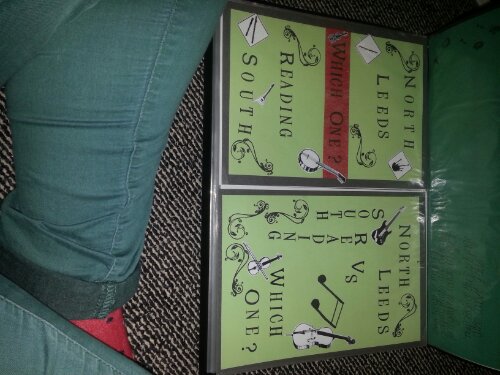
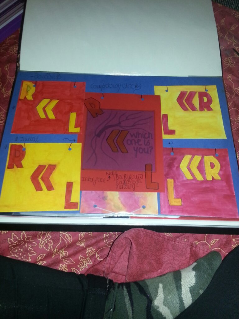
The North and South show very different trends such as I can just imagine in the North a gentleman wearing a tweed jacket which a dog due to the persumptions of farmland and this between the division. Language aspect and trend also converts in to regions between the two areas a socio economic division which exists between wealthy developed countries to create the rough mock up of a brick wall but cracked in half the reflecting the division between North and South with a tag line for students which says “Which one makes the greatest festival? hash tag leeds and reading via the banner design showing Leeds and Reading but when you go over it with the mouse it changes colour to Reading and when the cursor comes off it from the mouse it goes back to Leeds as normal but with a interactive feel and understanding towards it. The countdown clock will be a add on for various websites to promote Leeds and Reading showing the interactive feel again towards this festival.
POP & POS: POP is the Point Of Purchase via my product/ service via promotion is to gain capacity via the student market gaining loyalty by the division of two regions. Obviously you’d buy this ticket main headline acts but because of the fact I have to make this saleable and attract the student eye I have to show history and regional diversions due to this. POS items are a very good way and a effective way to get new or existing customers to notice new products. My Point Of Sale is to show all these amazing experiences in one promotional advertisement of Posters:
Skyscaper banners and also Countdown clocks via the event to get the hype up about the experience POP and POS items put the branding message and marketing promotion right where the buyer makes the purchasing decision. My poster design POP is to promote Leeds and Reading Festival via regions and the division between North and South, the POS is to show the experience and hype between the difference of Leeds and Reading and how they alternate there music on different days from Leeds and then to Reading which was also new to me and I didn’t know until I started digging around when I was researching. POS will make people notice and decide to purchase a ticket.
POP of my Skyscraper banner is to show anyone who visits any website that my design will be there to attract people to buy a ticket and gain capacity and hype by changing the colour to Red when clicking over it with the mouse and back to Yellow when you click off it to show show interactive features combining Leeds and Reading. POS people will notice this and buy this by clicking on this to be located to the Leeds and Reading websites. POP of my Countdown clock to show the hype and experience before it even begins and to countdown until the day of the Festival. POS of my Countdown clock is to attract new and existing customers to begin hype.
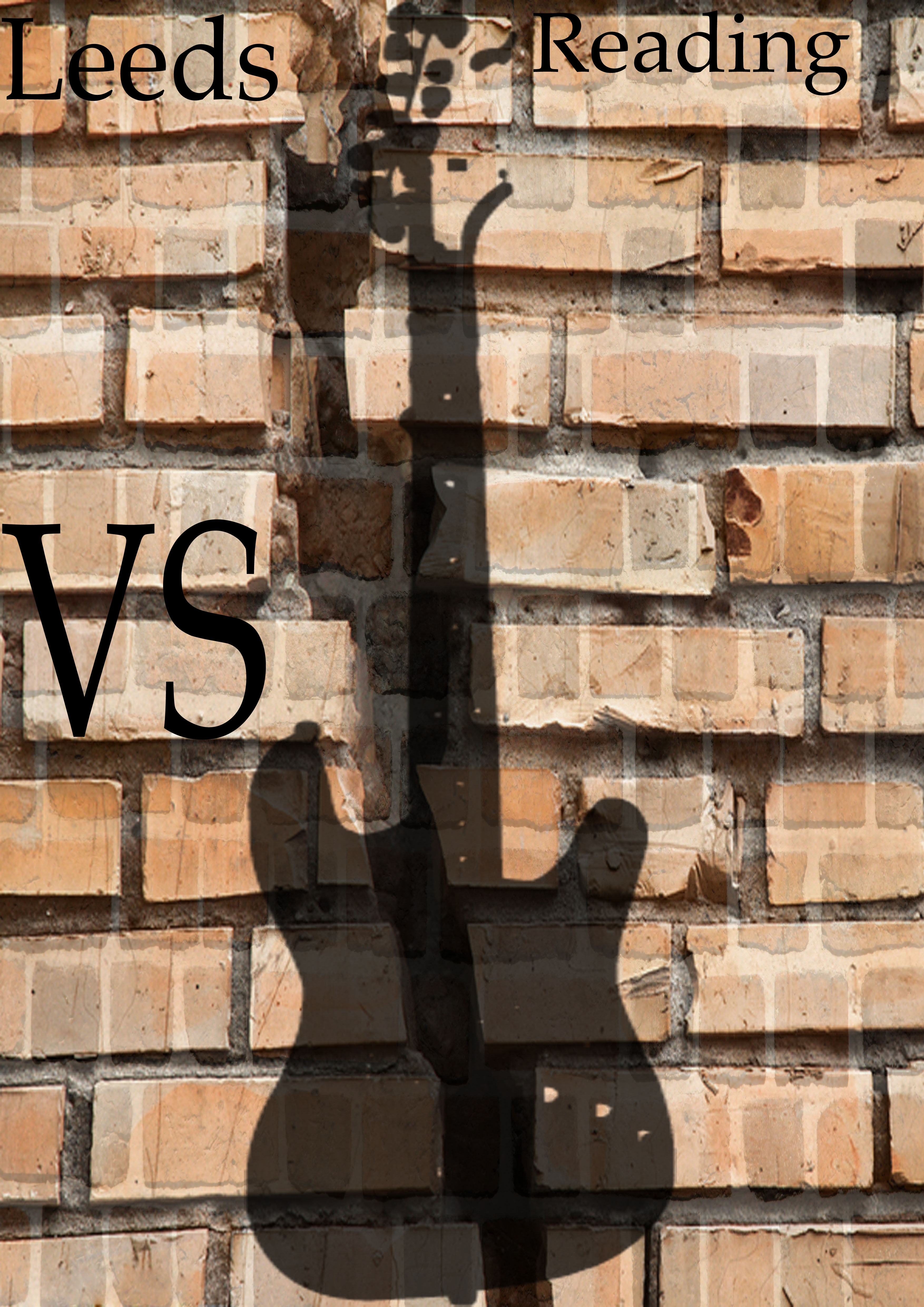
I created the two designs in Photoshop the first image using Lens Flare then pixelating this a little applying the pre made logo from the package file. I do know the second design will not be accepted due to not being the correct brand colours but I would project this anyway and looks like a traditional print rather then computer based work which is surprising, Using the original background from the package file but producing Hue Saturation to the image to make it look taditional. Also then using the logos: Leeds and Reading which is projected rotation reflected in this design. Also using BrushKing for Photoshop my idea for this is is to produce the vehicle is the poster design and then the Skyscraper banner design also the Twitter feed that is the function of promotion the actual idea consists of two experiences Leeds and Reading. I also created the third skyscraper banner in Photoshop using two types of brick walls then changing the opacity and then creating another image overlay changing the opacity to connect with the brick wall showing a Leeds VS Reading divison in connection with the type and musical image to show relation with the festival.
Via the idea of regional aspect of two different places bringing the idea together saying Leeds VS Reading and Reading VS Leeds. Also showing the experience through two different events and through the history of the event to attract students through different experiences. Personally the best music is at Reading but despite this I will do this as a VS idea versing the other event to show competition and gain capacity. My idea will be friendly for student loyalty but loyalty towards the area in which they’re from or in which they’re traveling to to gain that experience between the division of two different places and experiences. Between the diversion of Rock and Indie and Rap coming together against 2013’s main headliner which is Eminem even though fans did debate about this.
This has been professed as to diversions of two events but in the making creating people to come together as one and a unity. You get different people all around who likes different genres but Leeds and Reading the brand connects people as a whole once they go to this event connecting with student loyalty. Also the power of this is to show the idea through the history of Leeds and Reading to form connection with tourists or to people who already live here to show loyalty and support and gain capacity via this idea. Online ideas are Skyscraper banners, and the twitter feed countdown, Offline ideas are promotional posters and billboard ideas for public use via this method. Doing this professionally and being commercial about this and during the production focusing within what students like.
Blister Packs: Blister Packs are packaging for small consumable foods and items for consumers to buy. Blister Pack material is several types of pre-formed packaging made from plastic, the main type used for Pharmaceuticals. The Primary component for Blister Packaging is cavity or pocket made from a formable web, usually a backing of paperboard or a lidding seal of aluminium foil or plastic a blister folds onto itself often called a clamshell. I will not be using this material or packaging because I have no intention or use to just because of the service I am promoting and in this way
I actually have no use to use this as a starter pack for Reading and Leeds Festival is I was creating products such as t-shirts and posters and leaflets which could be packaged in this sort of way. But since I am only doing one Poster this would be a waste of packaging which is only one offline mode my other two ideas are online so this would have no use at all I thought I would still research this anyway to show that I have met the criteria. Blister Packs are usually used for pharmaceutical tablets, capsules or lozenges, Blister Packaging can provide a barrier protection for shelf life requirements.A degree of tamper resistance, and to sell hygienically for consumers,
A clamshell blister is is known for used variety of products and goods it can be used as a security package for deter package pilferage for small high value items of goods. Such as consumer electronics this is good for the suitable packaging which suits products like this. It consist of a sheet folded in to itself and then fused at the edges these packages are securely heat sealed and making them difficult to be opened or tampered with in the process to be opened. I would still not use this material due to the service promotion I am providing this has no use at all to my idea or end product of design.
Dye Cuts: Dye Cuts or Die Cutting is refferred to as the general process of shearing using dyes the process of dying shapes or cutting shapes out of webs. A die manufacturing industries deals with to cut a shape or material using a press or molds, dies are generally customized to the item in which are used to create. Products made with die ranges are simple from paper clips to very complex pieces using advanced technology. Shearing also known as dye cutting which is the process in which cuts stock without formation of chips or the use of burning metal the cutting blades are straight so, the process is called shearing cutting the item if the cutting blades are curved then this is shearing type operations. The most common types of materials used for cutting are sheet metal or plates, however for items and use rods can also be sheared, Shearing type operations consist of using the methods of: blanking, piercing, roll slitting this is used in metal working and also with paper and plastics. I will also not use this method because I am not cutting objects or making the object as a end process I am promoting the service of Leeds and Reading Festival so I thought I may include this via research of materials.
The process of dye cutting doesn’t appeal to me for the work I am creating like my ideas are online and offline uses so this is not a product to be an end use of. I will not need to use this process at all because I am not making packaging for a end product I am in the production of creating online and offline methods of promotion. I thought I would include this though for research methods on design and materials because it is still somewhat useful in many ways even though I shall not be using this at all. My three components for design will be, Poster, billboard, countdown clock and also a skyscraper banner which will be enough for the design.
Print processes: Printing process descriptions consist of the reproduction of text and images, typically with ink on paper, or using a printing press via print making but as thought my traditional media methods and ideas are not going to be shown this will not work for my design. This is often carried out on a large scale industrial process and is also an essential part of publishing and transaction printing. The earliest form of printing was from Wood Block printing with still existing examples from China dating before 220 A.D. and Egypt to the fourth century. Later developing for printing came from the uses:
The uses of developed moveable type this was first developed in Bi Sheng in China and the printing press, a more efficient printing process for western languages and western cultures. With there more limited alphabets developed by Johannes Gutenburg in the fifteenth century. I have decided not to be using printing methods traditionally due to the amount of time I have left to complete this assignment so I changed my idea to be more Graphic based using computers because computers are a lot more quicker then using the traditional methods due to the amount of time I do have left this will not work or be good to do in the amount of time I do have left.
Woodblock printing is a technique for printing images and text, or even patterns widely used in East Asia it originated in China a method or printing on textiles. Later on then using the material of paper, as a method of printing on cloth, the earliest surviving examples from China date before 220 A.D. With again the Egyptian examples from the fourth century. Again though I shall not be using these print processes as traditional media I don’t think I can salvage anything from doing this anyway such as the correct colours for the Leeds and Reading logo so this would be a complete time waster out of all.
Advertising Space: Advertising space consists of space advertising using advertising methods from outer space, some even planning to launch big billboards visable from earth. Obstructive space advertising is the term used for such ventures, obviously I was curious about this point I will not advertise in space because that is impossible for lengths and methods for this assignment but of course you can do this.This also can consist on the factors of advertising space within the publication of advertising and the space within that piece… Like the alignment and arrangment inside the piece which will be advertised or used for advertising things like this.
My advertising space will consist of a Countdown clock a poster and a poster fit for promotion in a billboard via situ view for commercial use also the skyscraper banner creation to show people using websites in which they can view this. It will be all consisted around alignment and how things will fit in to place and how this will work and be good enough for professional commercial usage. This will work like researching other commercial professional festival posters which I have done and this will be lift off to my design ideas which I have already started the first couple of ideas but these are not my main or initial thoughts to this design process of work. The processes are vital in space via the professional touch.
And where things will be placed via industry and professionalism will be vital. I will not use the spacial method as much though because I know my idea will not fit much around this for the client but at least I have considered this for research use. The designing methods will consist of type within design and will be the main aeshetic for the designing process and all the components that go with this in a design way. The materials, the form the function the structure and how this will promote to the right market of students between the division of regions between North and South and the main divide of this.
Design responsibilites, Cost, Health and Safety and Functionality and Cultural design affects: This will affect the design I am producing although I have considered these factors all together using the responsibility of the style guide as my main helper and guidance to all of this, Correct use of alignment, colour, type, fonts designs, typefaces this has been the massive helper. The Health and Safety issues will be no problem at all because how can Online modes hurt you physically there is no chance of this Offline my posters won’t be made out or metal or other material that may hurt people so I am all good on this factor.
Responsibilites within Design I watched clip of Philippe Starck about the form and function and the importance of design within industry and this opened my mind up on how to create the end product by not using mixed media and my ideas derived from this except these where my own. My own idea showed the regional aspects between division but this also had to be implamented within design and designing methods. I have considered cost to my posters which will be around £30 pound at the most and the limited just out of guess also myadvertising design this will around 20-30 pounds for theonline mode maybe moredepending on design to bepublicized for and via thepublic.
The function of my Online modes will consist the skyscaper banner which will change colour so when you scroll over it with the computer mouse it goes from Red back to Yellow once scrolled off this will also consist the countdown clock which will be a basic countdown clock to gain hype and awareness until the date is finished. My poster function will be inorder of promotion and this will consist of publication and promotion so students are aware and understand the function of promotion such as POP and POS this will all come in to this in my end outcome and process. Responsibilites of branding and communications within branding and legals.
By Loren McDonald, Art & Design, Hull College (Park Street).
Ideas:


Final Designs:


Final Designs.


Intial Ideas:


Demographics:
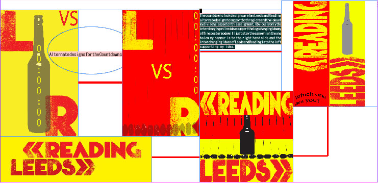
Leeds & Reading Function to the design and demographics. Demographics are a better word for Target Audience or the Audience aim, the type of data, which are used widely for public opinion, the annual music festivals years being present where between 1961. These designs of the Countdown Clock/ feed via Twitter relate to students due to design and target audience of what students like and are in to, I have also used the original colours combining the colours gray and black for the Live Trace designs this would attract to students with the banner designs and the poster due to promotion of Leeds and Reading Festival showing the continuity in colours and design to the promotion. The function of this is to show the original Leeds and Reading logo to alternate over the mouse and then once you move the mouse it goes back to normal this is for the Countdown Clock design. I also decided to do the same idea of the continuity logo and contrasting colours when you go over the design with the cursor it goes to the original design logo this is the functional aspect to promote Leeds and Reading. The function is explained below the Countdown Clock designs creating the hype for Reading and Leeds and the banner idea creating the divisional aspects from my idea, North and South’, the function for this is to create home excitement also showing loyalty through long period of time and the trust will come to students via it being yearly and also popular to students and music lovers! The loyalty aspect is show in the designs as to what students like and which festival is The countdown clock designs are two Leeds and Reading alternate designs to support both regions and the idea of my divisonal aspect on this assignment. Obviously only the interchanging online ideas support the logo changing idea my offline poster mode will just stay the same which the one below my banner is to the right hand side and the interchanging ideas of Leeds and Reading is to the left supporting my idea.

Evaluation
Printmaking:During printmaking sessions I produced various background designs which mirrored the R & L which showed to be good during the designing stages and this made my work seem more enjoyable I actually did enjoy printmaking in this assignment because it took time off researching and gave me a break to do something traditional and fun to create and had relation to the assignment from using masking tape and various methods of texturing the various prints during the designing stage.
CAD: My CAD experimentations have been used very well using variations of experiments with Illustrator and Photoshop I did not end up using Photography in this assignment due to it not fitting very well with my idea. I used the variations from developing work to be professed as fragments towards the final pieces. The thing that has worked well during this assignment is that the processes of live tracing designs and this took another side of things and outcomes towards my work. This has somewhat worked well I suppose.
Traditional Media:I have used variations and experiments of mixed media to form my developing and initial designs for this assignment from the main traditional uses of paint to oil paints, pastels to oil pastels and also some craft works for this assignment to develop more ideas with this term of ranges.
Research:The research was useful but I didn’t enjoy it because it took so much time instead of designing we had a week left to do this/ 2 weeks at the most which just made me hate the whole research processes all together anyway. Also this made me feel like the points to this assignment was nothing and I felt it was too researched based also CAD based but I actually enjoyed this part for once in life.
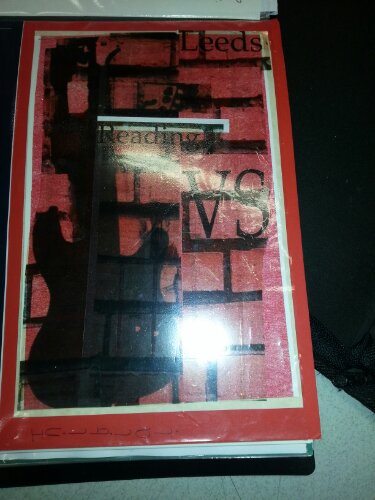
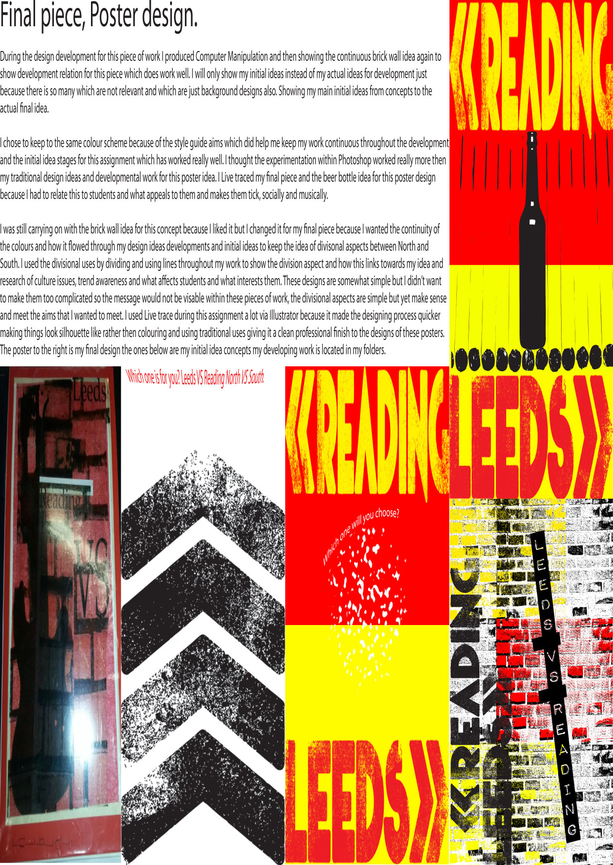
Final Piece one: Poster
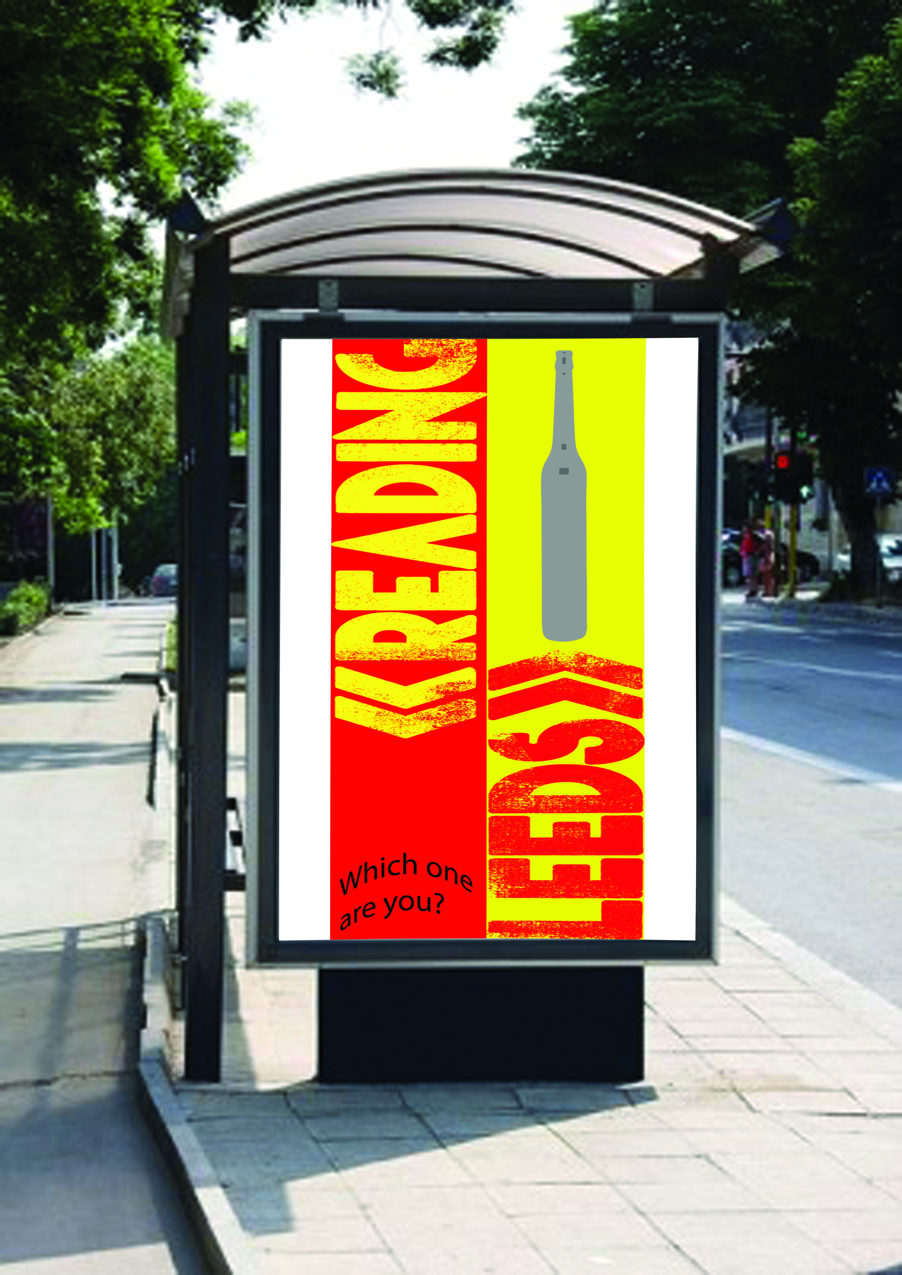
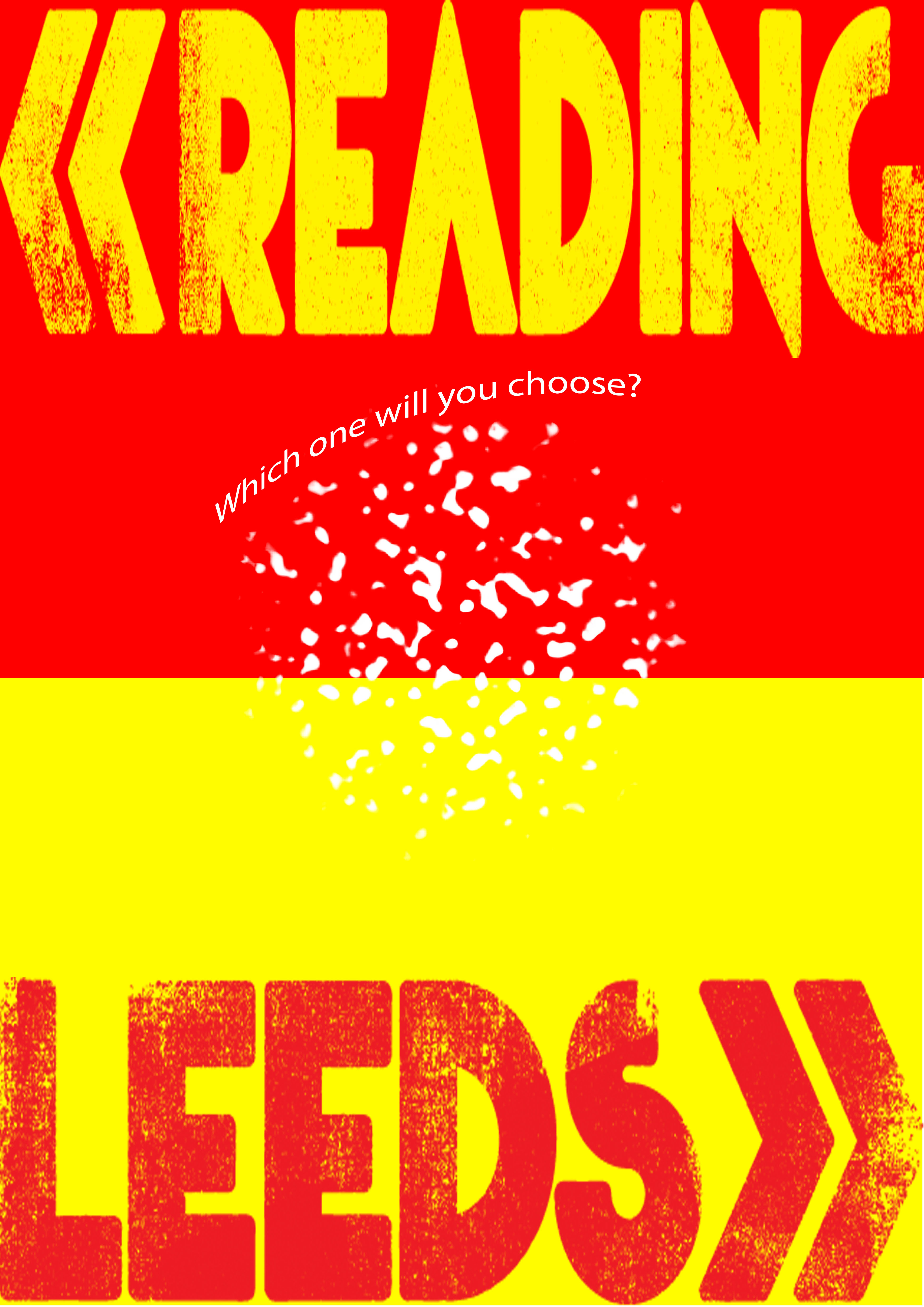
Firstly I added a new document at this size of A3 and then I divided the page in to a divisional aspect to link between the North and South division idea which I am acting upon, then colouring the boxes of this Red and Yellow to show the original colour schemes towards this idea and consideration for the logo.
Then loading the pre-made Logo designs originally from Leeds and Reading on to the design and sizing them as on my initial design idea from my designs, creating live trace designs in Illustrator and then putting them in to Photoshop for my design final piece and changing the Opacity to 36% on the cigarette design and then 63% on the Beer design to show student relations and loyalty with the divisional aspect idea still strong.
Using the method to refine the edges and make it 250.0 in radius, smooth 100% and feather method 250.0 a contrast of +1 to create this effect for the image, selecting this image with the magic wand tool and inversing the cigarette design.
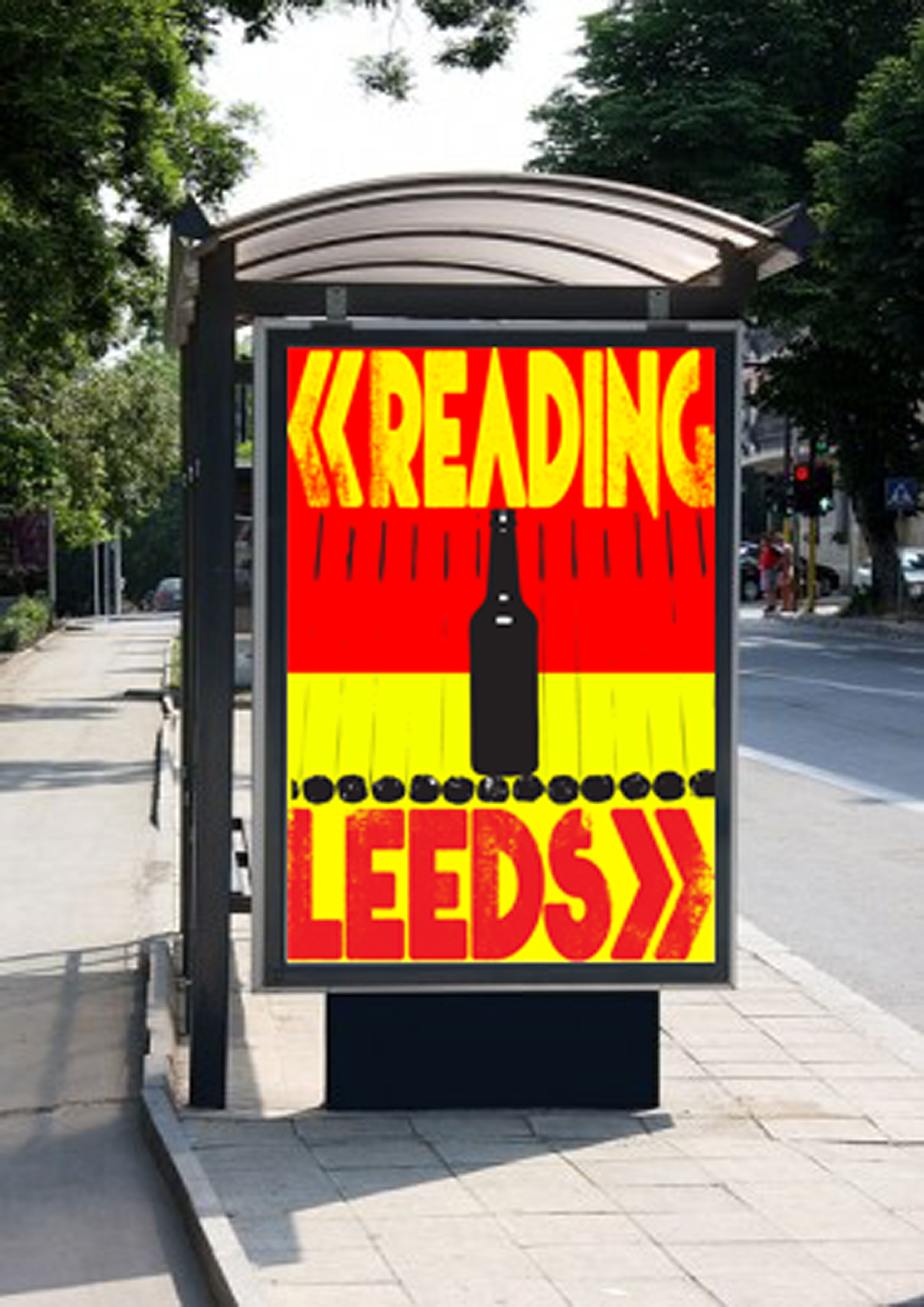
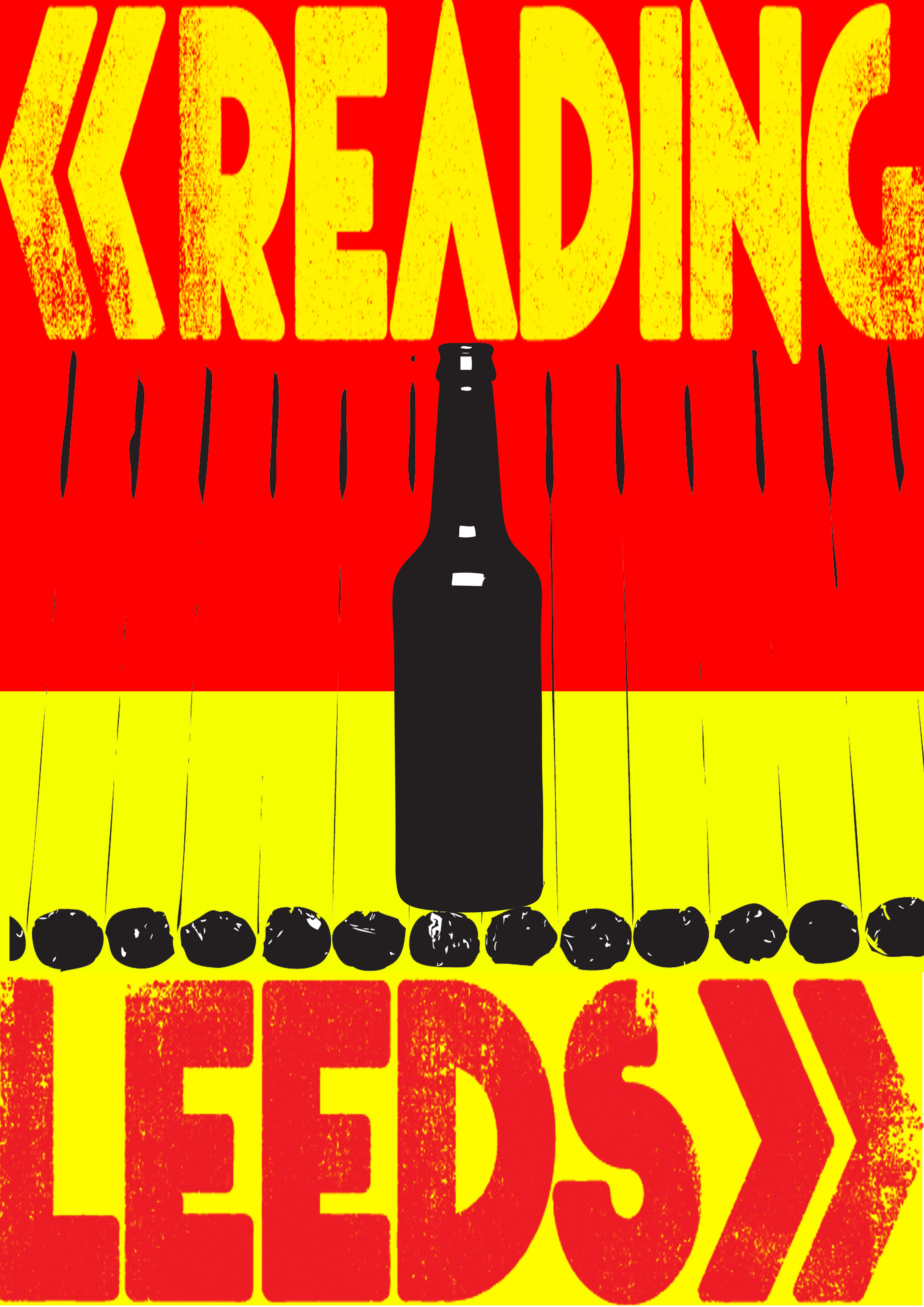
Countdown Clock design final piece
Firstly opening a new document A3 Size and using the traditional ideas but inputted as Computer generation to show commercial use and professionalism. I am going to create alternate designs showing the Reading logo background and also the Leeds logo background to make this a fair banner to show design use doing the same to the beer bottle also. Using the magic wand to select the Leeds and Reading letters to fit my design idea but colour overlaying the original Leeds colour, which was red to yellow. Using the horizontal tool for the time and the relation to my idea concept for both of these designs.
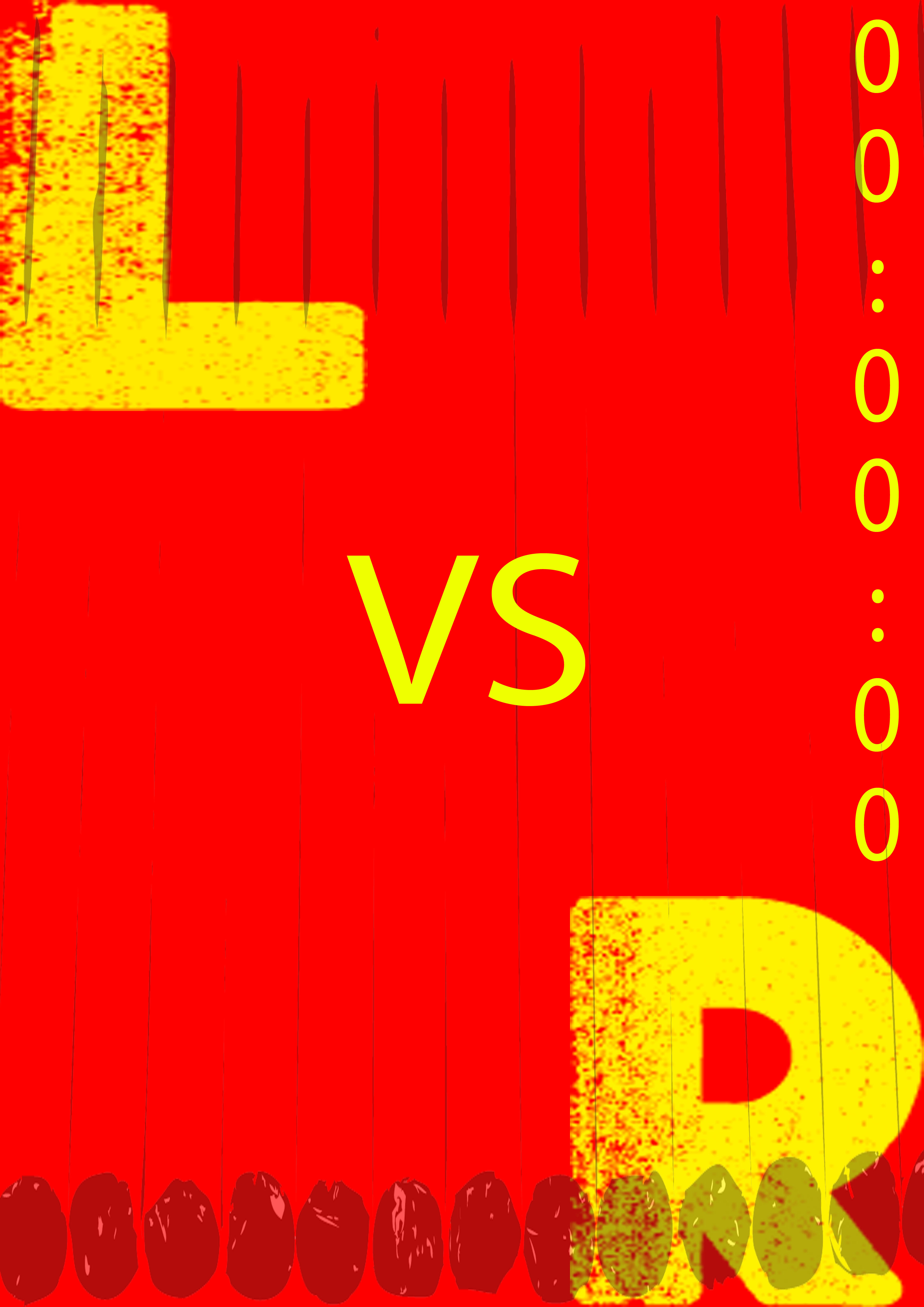
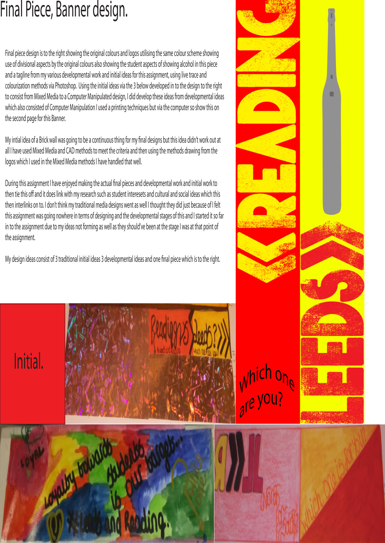
Banner design final piece
I made a new document in Photoshop and divided the page via my idea using the original colour scheme for Leeds and Reading and then using the original logos also with a hierarchy effect. Using the type of recent developmental designs and also the beer bottle design via this banner. My idea still consists of the colour change but with the main design and still is interactive when the mouse goes over the design when in the online mode this still consists. Then using the magic wand tool to go over the beer bottle in order for it to change colour to vary design.
Situ View for final pieces
Finding a blank billboard online creating a new document in Photoshop A3 Size then fitting it to the right shape of the billboard so my design won’t be cut off then slowly Skewing this and warping this design to fit it for commercial use via exampling it.
Bus Billboard for poster: Using the same method for this but shaping it to fit the billboard size this will then be done for my Banner design and my two alternate countdown clock designs in the same way developing 6 situ views 3 bus billboards and 3 normal billboards.
Solution to the assignment: This assignment has been a tackle due to the style guide and how strict you have to fit to this guide and how the colour scheme has to link towards this to fit and the aims I have followed this to a extent, I have used variations of experiments such as Photoshop, Illustrator and InDesign and this has been somewhat difficult to be put in a professional position and being a commercial designer I somewhat feel I haven’t putting 100% in to this assignment because it did not interest me at all.
The only aspect of this I did enjoy was the developing and mixed media and designing stages to this assignment. I enjoyed the choice of the assignment it was just due to the ideas being put across and where to start which affected me the most because I didn’t know where this was going at all.
I enjoyed live tracing part of my developing and initial work because I do love the effect this has on my work the professional clean finish and feel toward my art working, I didn’t enjoy the research side of this since there amounts of this to do and also just because of the fact it took up like 40 pages which ate my printer credits all away. I enjoyed the planning stages of this assignment just because it helped me and my ideas be projected more and be more refined to what I wanted to do as Developments, Initials, and a Final Piece at the end of this assignment.
My adaptations towards the background designs and the ideas towards have helped me with the designing stage of the Final Pieces and also this staged has helped the most during my designing stages. My final ideas vary but still use the additional aspects of my first ideas which was between North and South and this was developed as varied developments then in to initial designs for the final idea and final solution and use to this assignment. In conclusion I didn’t like this assignment because my ideas was doing nothing for me and gave me no use until further on the assignment and this made me not enjoy it because so much time was spent researching and this made me not enjoy it at all.
Situ Views: