Review/ Evaluation:
This project has been enjoyable the commercial production side of this not so because I don’t count my work production as commercial and Graphic based so identifying my work was more difficult in the means of it being commercial and professional based. I was going to show Photography based elements and also traditional elements in my work but I didn’t have enough time producing my logo took all the time to correct and also the developmental and initial studies took a while also.
The production of my work which really did take up the most amount of time is the research although half of this was not useful at all like looking in to Graphic Design when I wasn’t Identifying myself as a Graphic Design although it had some positives for my influential designer, Si Scott who I took inspiration to his work.
Also the process of development within this developmental work was also the toughest part re-producing the vector work because I did my idea process far too different from what was being asked from the brief I was going to focus on more traditional elements but also this was not possible due to time constraints I am going to focus on what I love more on the FMP and this will be my way and idea of producing work I love.
I didn’t really put a lot of time in to this project basically because it was boring, I only liked the designing of my work and my initial developments to my pieces for my final piece I was very happy with the outcomes of two designs in the means of promoting and identifying myself as a designer and artist but at the end of the day I would’ve liked to show more traditional elements, even the lino piece for my printmaking may be a stretch to print on this last week before the deadline due to finishing last week so this is the downfall to this assignment the creation of things that cannot be produced traditionally which made me unhappy because the lino print took me a lot of time to produce.
I would’ve loved to show Photography elements but my vector work showed strong positions for identification so I took this idea on and developed this more overall this has been a okay assignment nothing too exciting but it was okay I guess.
Solution to my assignment:
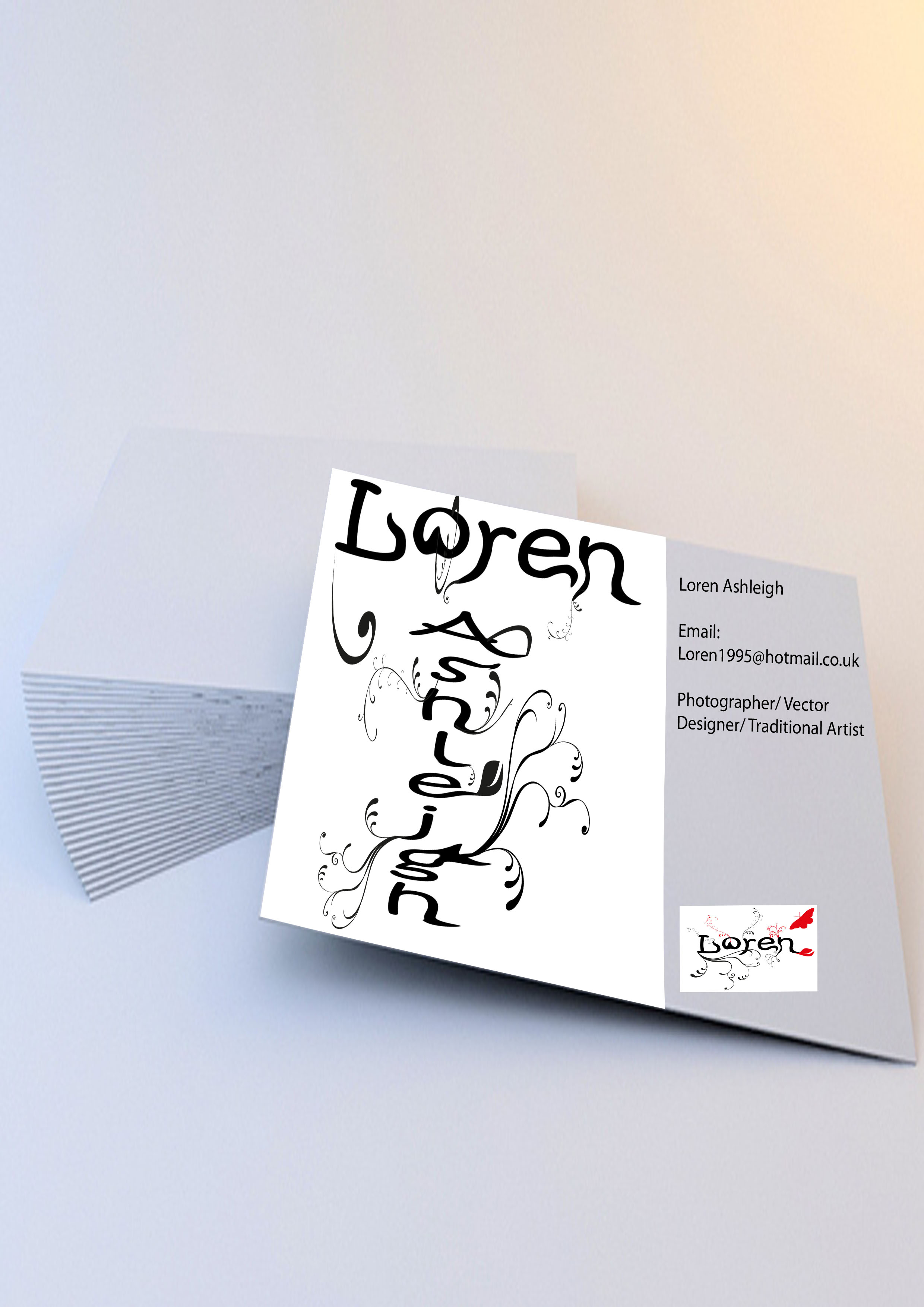
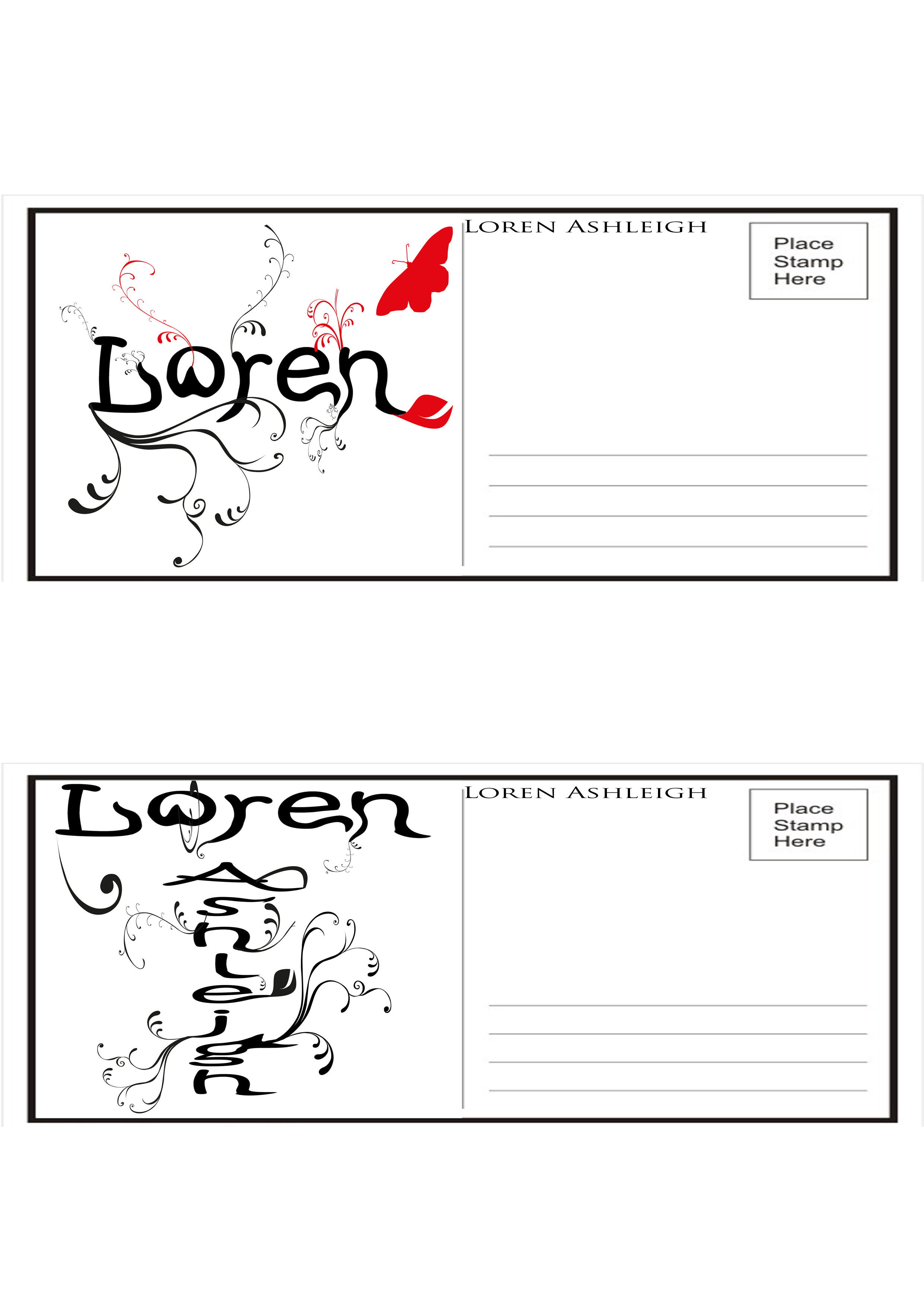
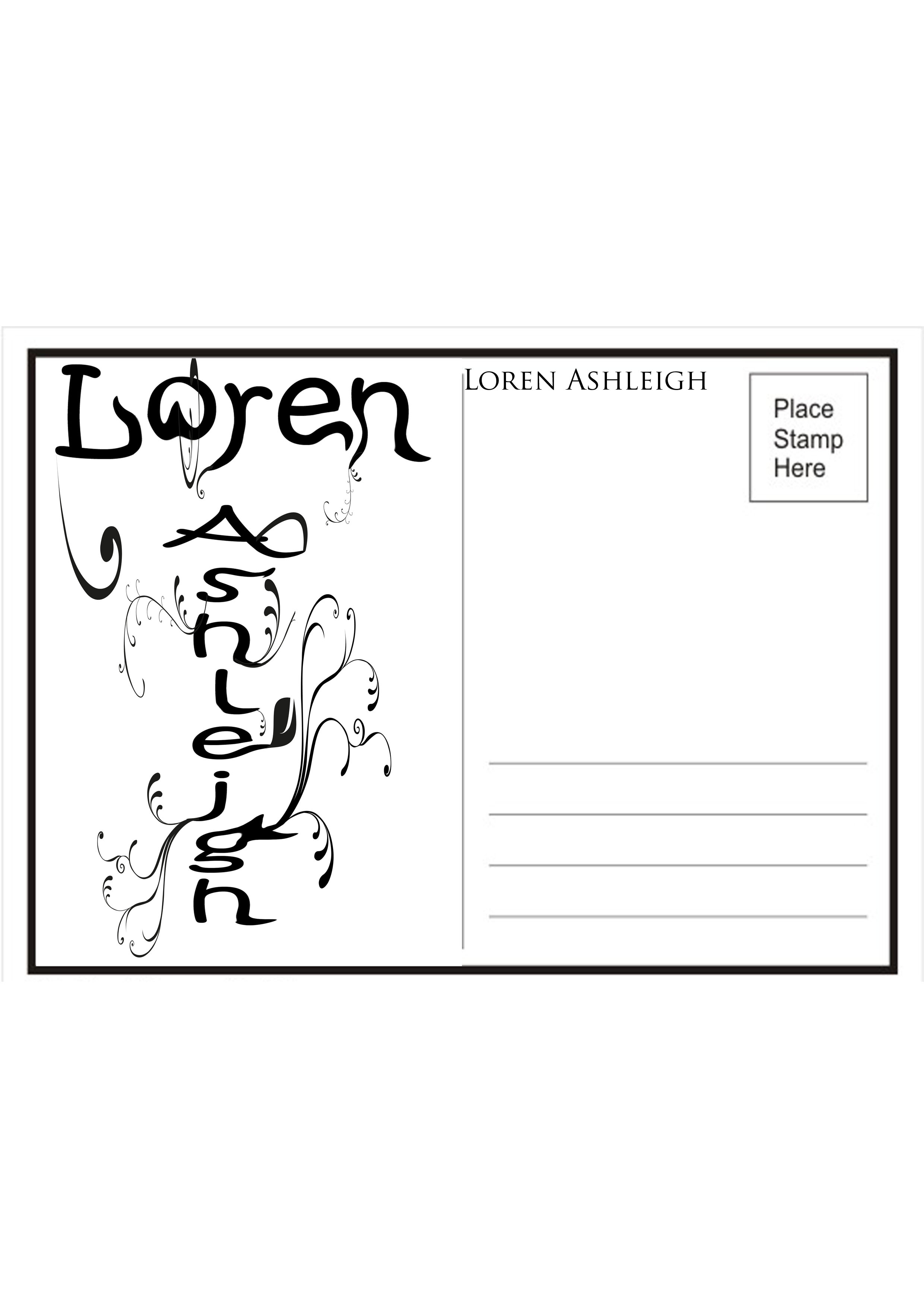
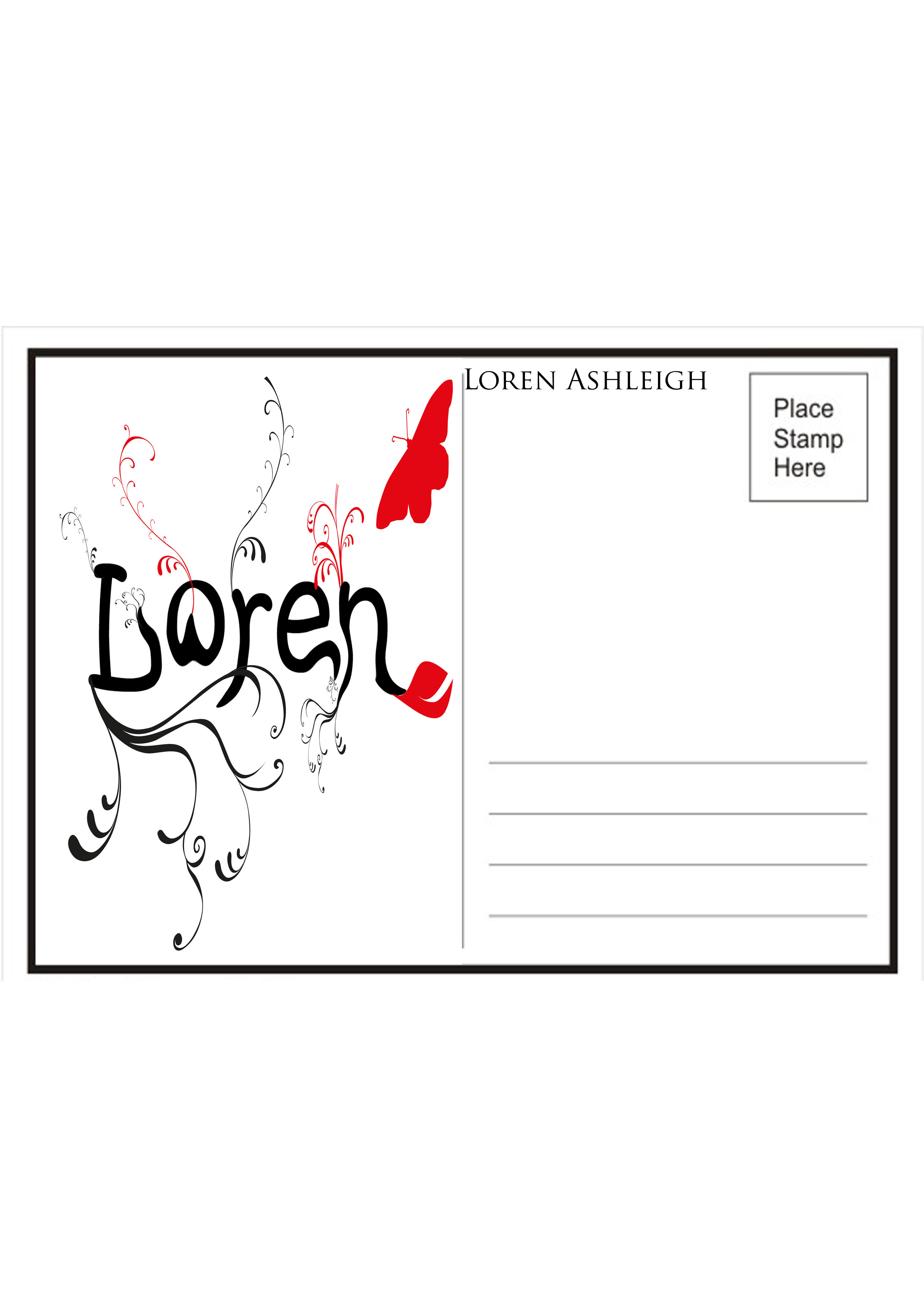
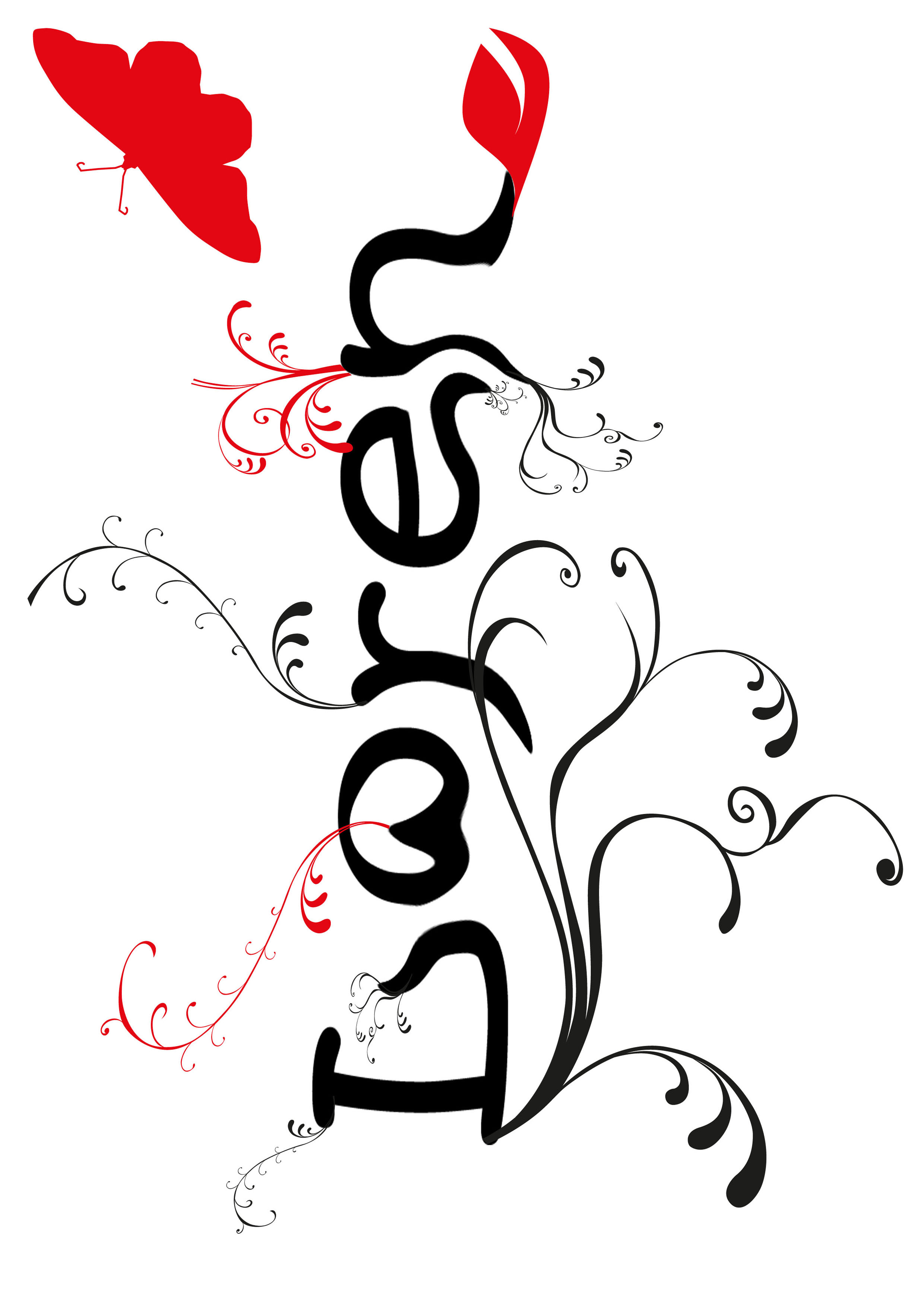
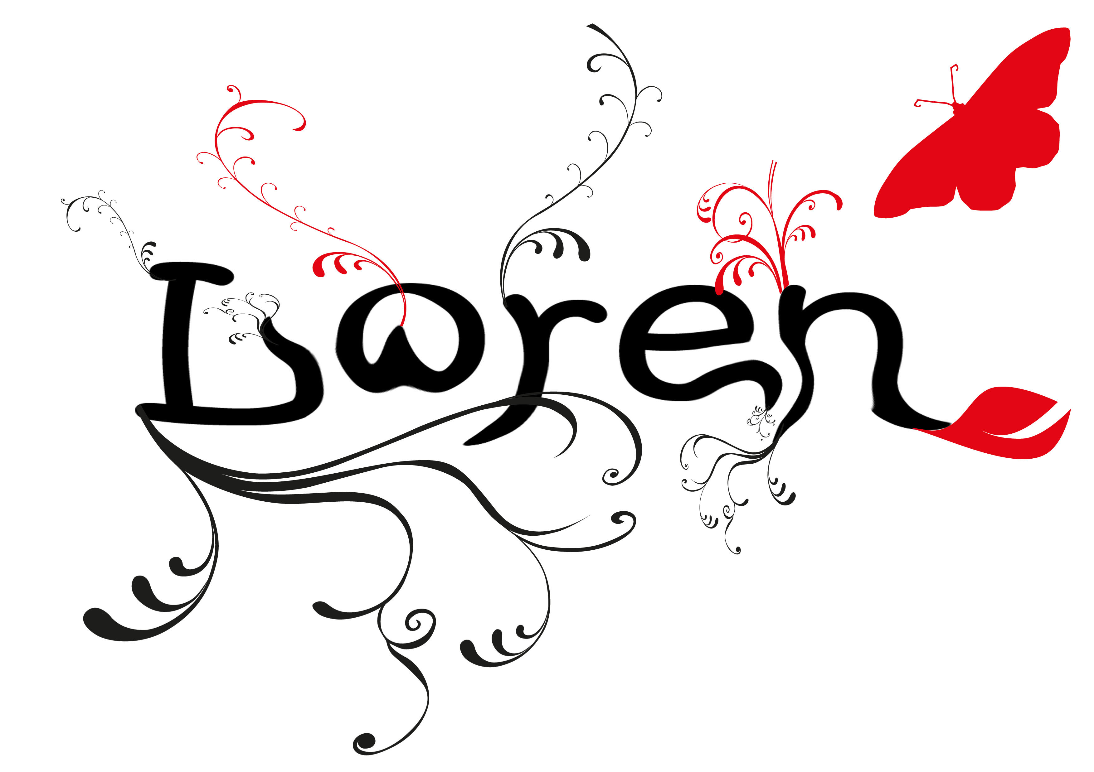
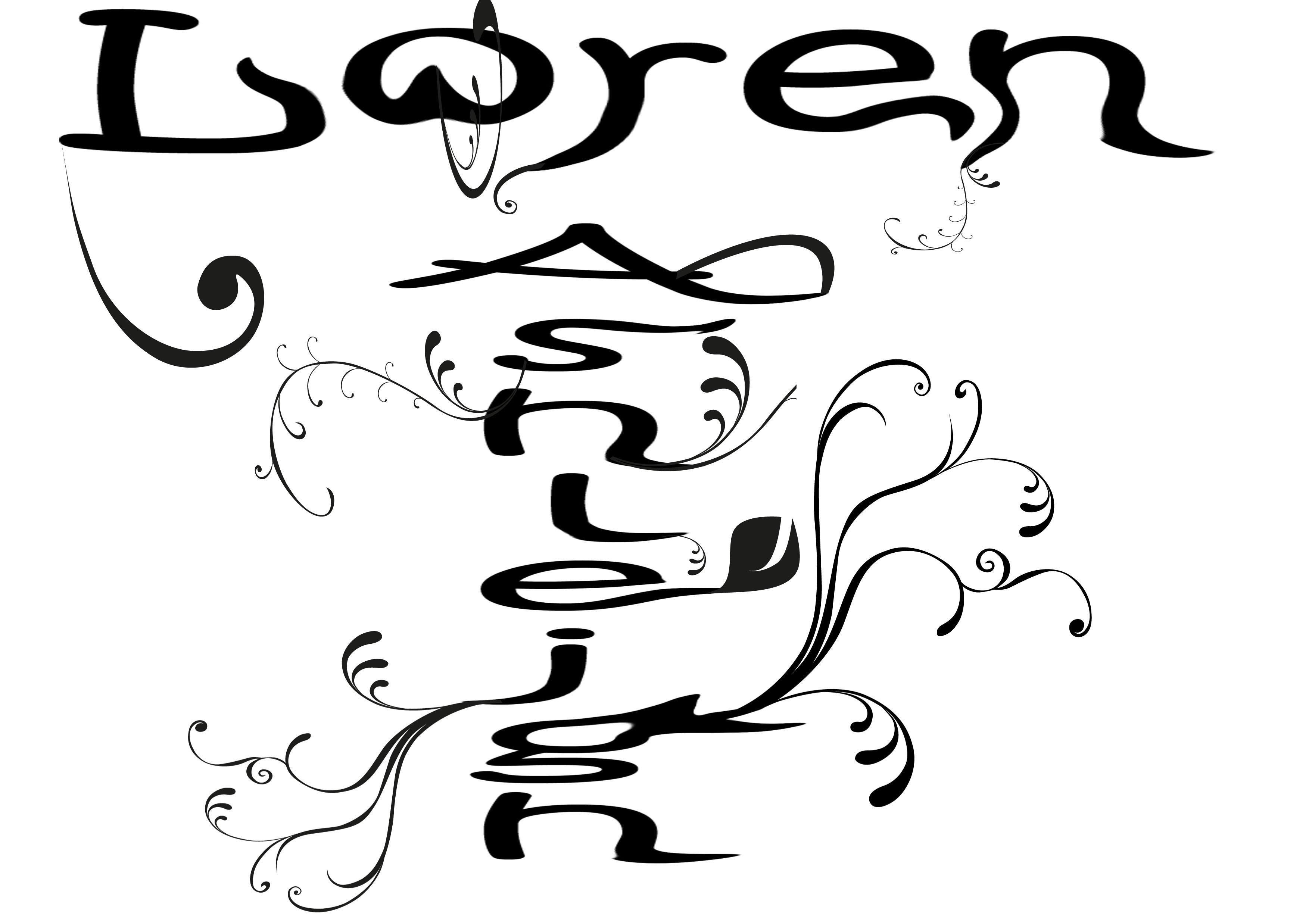
I did firstly develop my vectors from my idea base from the Typography project and carrying this on for more work and development using the same idea flow and same influential design to make my work and understanding more solid and more ground based for a strong foundation.
I liked Si Scotts work just because of the simple fragile production he works in to his work such as the handmade traditional development but still he is known as a Graphic Designer and a Designer which I could not get my head around. I liked the flow and elegance in his work which inspired me to create a solid idea for my Typography and also Identity assignment.
I developed this just from one designer that I love the work from, not because I am interested in his profession of work. Even the poster promotions he does which I evidence in my research I simply amazing he designed one from The Smiths song “There Is A Light That Never Goes Out” which really took to me as a lover of The Smiths it’s lyrics just jumped out to me and I said: “Wow! I have to evidence this”. Little things like that which connects to me as a person with the things I enjoy and love helped me to design my work and develop ideas from the research bases.
Those little things also help me to like the profession more than I actually do once I see some design that connects to me as a music lover, a Smiths lover and also the also relationship and connection to my work shows this as a Artists the amount of emotion and feeling from on influential designer just made my work and ideas became stronger and stronger to form a solid idea to my work. I did also produce a canvas on the poster idea which is on my WordPress but this is for personal use not college use I just thought I would mention this though.
Even the things such as the detail within Si Scotts work you can see clear relation from his to mine even though mine is computer based but if I had the chance and time I would produce mine handmade just to show traditional methods and not being too commercial and designer based and the use of professionalism I know this is important for a work environment and a designer based environment but I possibly couldn’t hate the work Graphic Design much more that is how I feel though because I see myself as a traditional artists and this is what should’ve been focused on more this past year production of things I love.