Post Card Templates using both of my logo designs to brand myself.
Post Card Templates using both of my logo designs to brand myself.

These are my Business Card Designs Logo one and two via using Situ View and the Warp Tool via Photoshop!
![]()
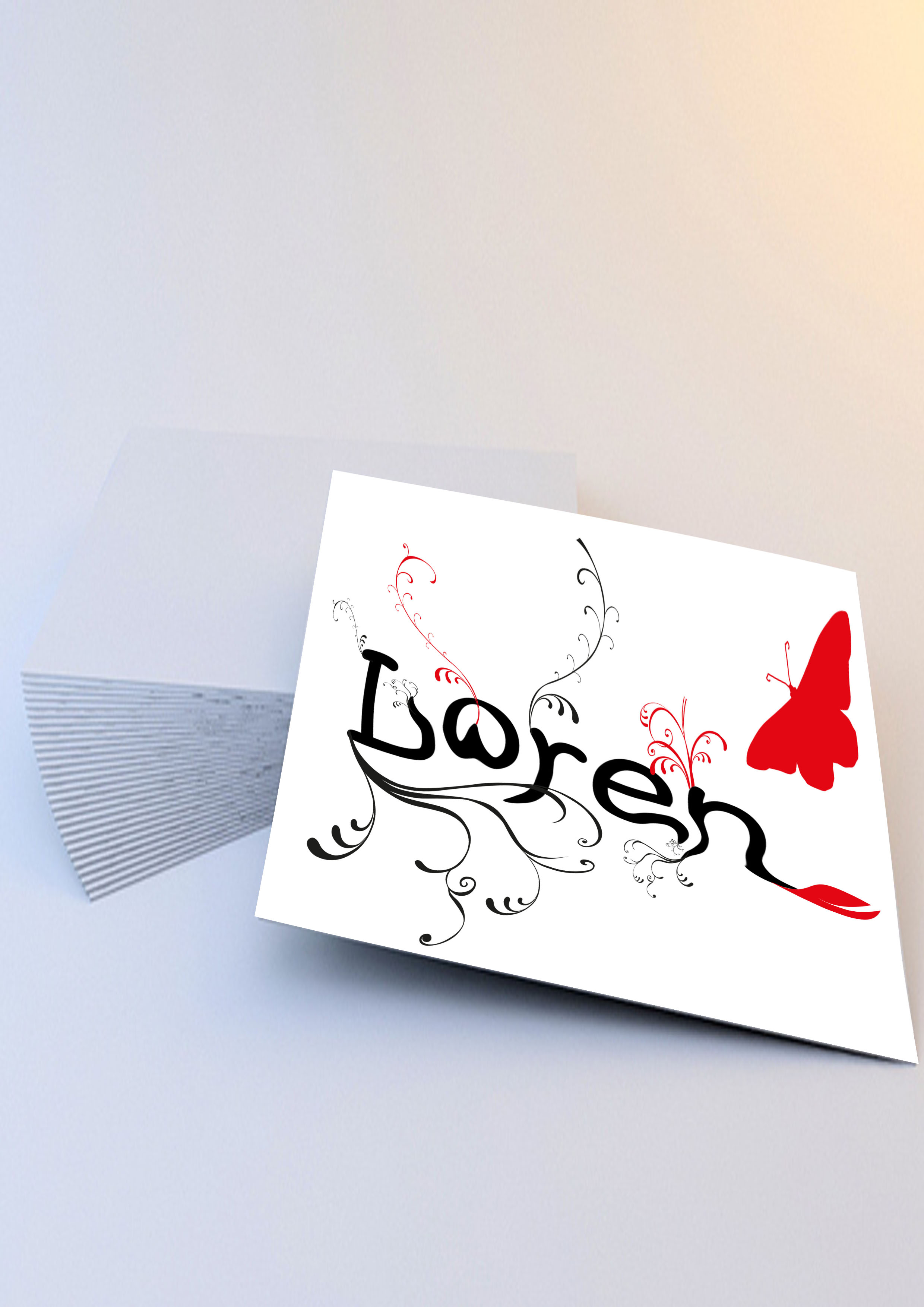
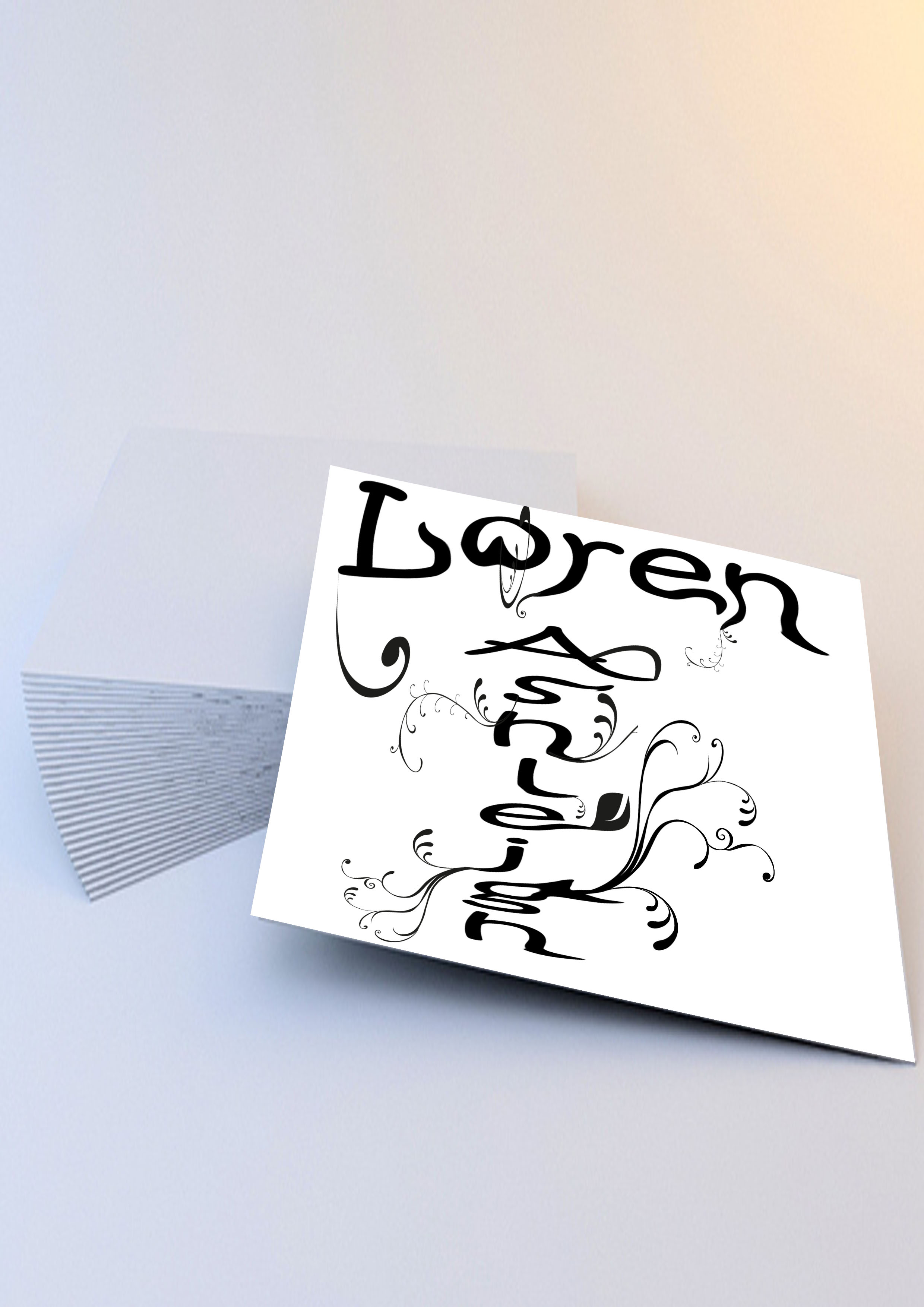
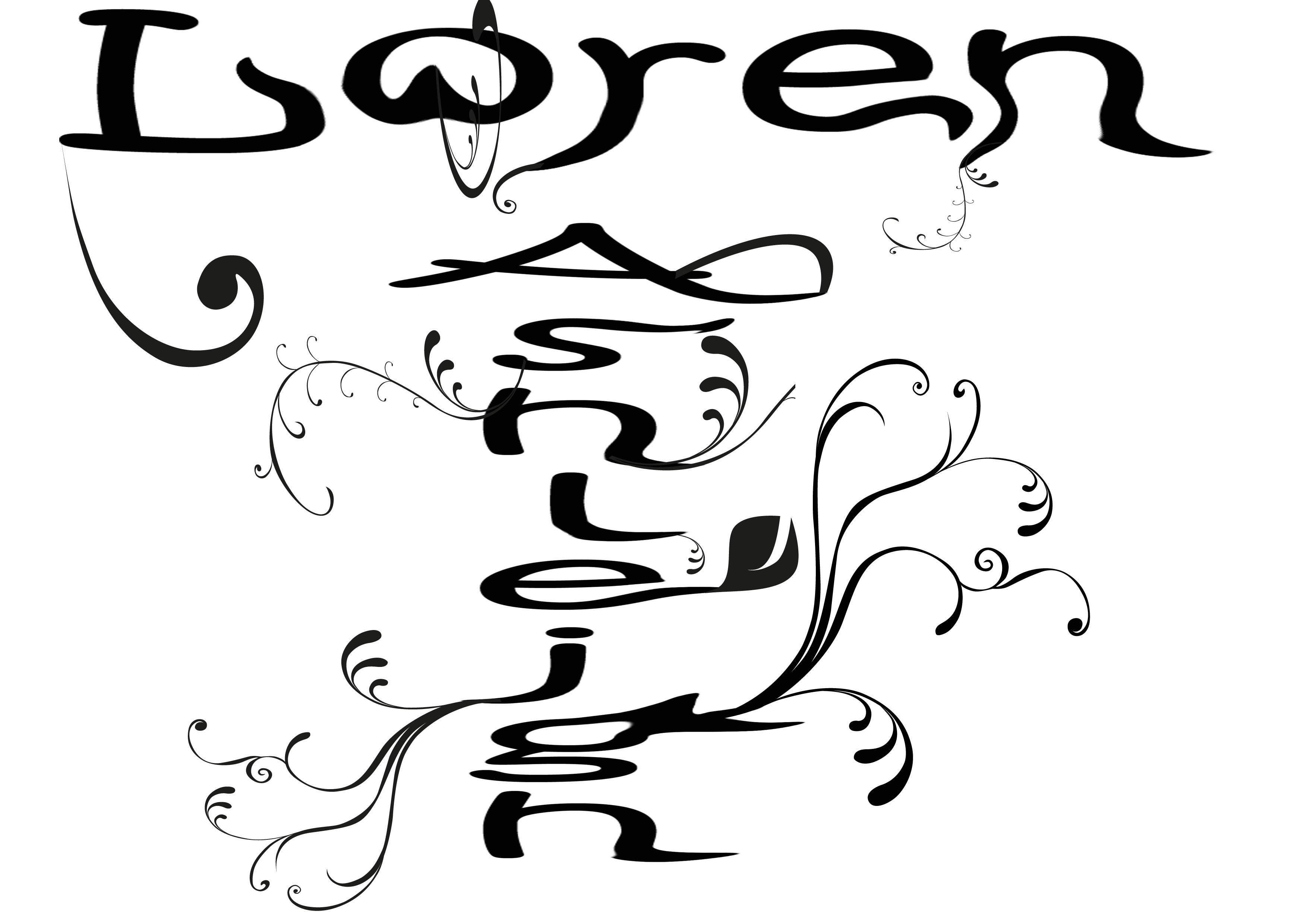
Vector Creation Design Two: Showing another inital idea for my logo to show I have experimented with two ideas with my first name and also my middle name.

Business Card Template with Two initial Logo Design Creations on 5 Business Card Templates to show more than one!
![]()
This method I used my Photoshop Liquify logo version then I transferred this to Illustrator to created the vectors I used via files from previous assignments and I did this by using two colour co-ordinates via Black and Red also using image vectors in here also which used space and also connects the delicate feelings to my work and also how Identify myself as a designer and what appeals to my eye and makes me tick within design.
-I followed this methods via previous Vector work that I have produced.
![]()
This logo design above is the early development of my Vector creation this version was created on Photoshop but this will be uploaded to Illustrator so I can use all my crazy flower swirls inspired by Si Scott around this logo design which will fit my idea and process which I discussed with my Lecturar Andy on Thursday of the week before hand in that this idea and this method would work as a logo design rather then the other designs that I made which didn’t take me that long to actually produce and create.

The Smiths music are a big part of my life I love Morrissey and so I thought I would put my feelings down on canvas going by my favourite song by The Smiths (There Is A Light That Never Goes Out). I have shown the use and evidence that I use my blog via personal use rather then also educational uses whilst showing people what I do during my college life.
Marshall McLuhan:
Marshall McLuhan is Canadian Philosopher, for communication theory he thought of the idea to how work was viewed to one of the cornerstones of the media theory in communication to computers.
As well as having practical applications and understandings of Television and advertising industries Marshall McLuhan was born in 1967 and died in 1980 at the age of 69. McLuhan was known for coining the theory of Media Messages through and the Global Village. Also for predicting the World Wide Web this was almost thirty years before the internet and the web was even invented.
McLuhan was born in Edmonton, Alberta, to Elsie Naomi (née Hall) and Herbert Ernest McLuhan. The concept and theory to his thoughts and Ideas was to produce a theory and understanding towards the concept of the internet and the World Wide Web before anybody has though about this before I can see the understanding in creating the message and the theory and the communication towards how this has been brought up within communications.

Internet language and communications through Linguistics:
Internet Linguistics are communicated languages for a language style which was advocated by David Crystal. Via Internet, New Media, Short Messaging Service, and Text Messaging to create our own preferred language through this method and mean. I don’t text speak but many youngsters do and it is evolving instead of devolving even my Mum and my Grandma uses these linguistics but is it creating space and trend within the design industry especially for Graphic Design which it is trending almost now.
Mainly in the sector for Typographers have noticed this trending and this causes collisions and mixed feelings about how lettering and design within type and images is perceived as a designer especially it affects me because I hate text speaking and the whole linguistic that goes with this so to known that it is trending through something I like makes me feel uncertain and about the design concept and idea of this who new linguistic and idea for this concept and trend.


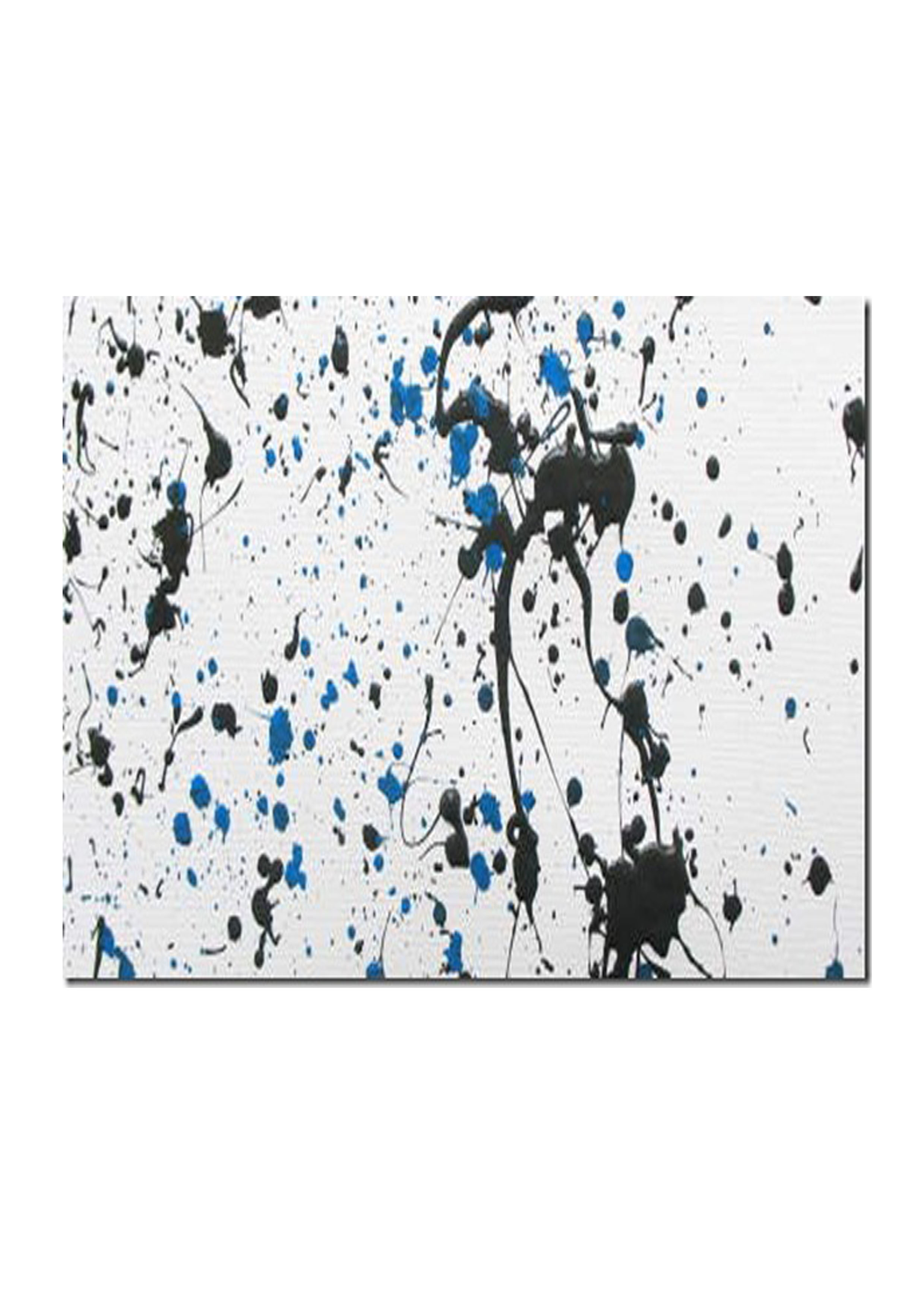
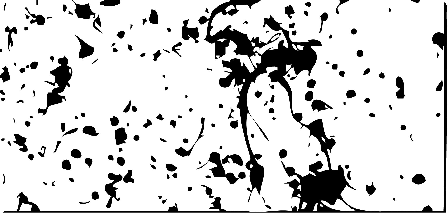
Paint Splatter live trace method for background designs:
This method was relatable towards my Design Andy showed us this design but I shall not be using this method I just thought I would evidence this instead he said about using font and type over this but I found this idea a bit tacky and unprofessional so I won’t be using this for my work myself.

Logo research: LogoPond.com
Logo design which was made for Bar/ Restaurant in New York this is client based work, using tags by, fresh, modern, typographic letters. I chose this pieces because I like the transformation of the curve with the relation to the shapes I have been using for my work. I love the colour scheme due to it being my favourite colour also the use of alignment leading and also kerning of this type.

I also like this design which was produced from a artworker ( Production Artist) for this persons friend called Tom I like how he has used negative shapes between the logo to still make sense and understand what the letter ‘T’ means even thought it isn’t formed properly I like the background colour and the layer way of using contrasting colours red over white.

This type also appeals to me because I like the font and the swirls and shape within this piece this piece is produced by a print company for client work, I like the alignment and space between this type the movement within the shape is also spectacular!
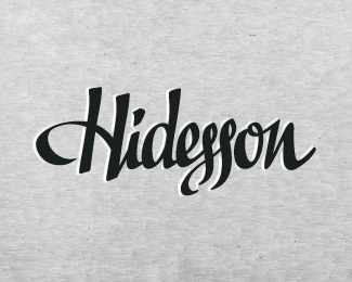
This has been produced by Graphic Design Studio for a client I like the shape of this which relates to my work for my inspirations for Si Scott for this piece of work.