Patrick Heron.
BBC: Your Paintings 1920-1999 British Painter and Writer and Designer a member of St Ives School this piece below is called ‘Blue Painting with Discs September 1962 and I liked this piece because it resembles an abstract boat with nautical windows which has inspired me for my drawing in to clay process on my abstract fish dishes this piece is oil on canvas.
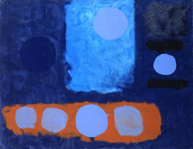
I like the colour contrast and shape inspired windows and orange stripe which to me looks like the base of a boat.
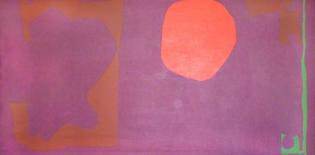
This pieces is called Violet and Venetian Scarlet and Emerald 1969 this is oil on canvas this piece reminds me of a Landscape upon a bright sun and the abstract shape to the left reminds me of a cliff shape or what resembles to be a cliff which I really like because of the colours and the background which lays upon the piece really well and connects to the piece as abstraction.
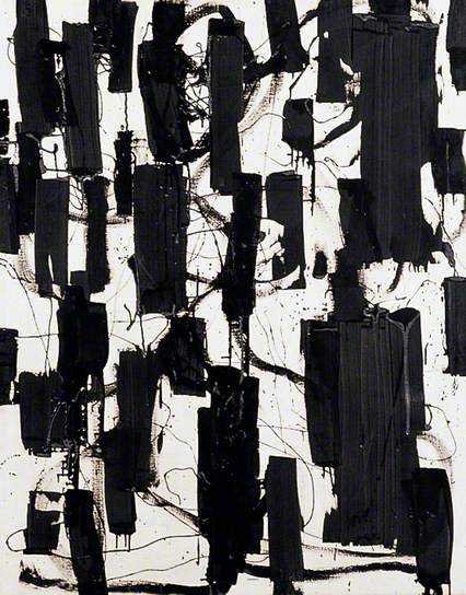
Black and White: April 1956 oil on canvas and I liked this piece of the black upon the white it really brings it out and it reminds me of groynes on a sea landscape which relates to my theme at the moment but I also like the block colouring towards this piece because it breaks the canvas up and makes it look a good piece of work also the depth of space in this shows nice with the white. I also like the dragging of the oil paint lines across this canvas piece because it reminds me of movement of waves when it resembles a landscape piece and this is why I have been so attracted towards it.
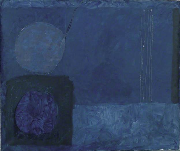
This piece is called Blue November Painting 1963 I liked this piece because it shows a landscape resembling shapes as sea landscapes of objects around a beach such as wood upon a moon November night which is why this piece attracted me also the simplicity of these shapes relate to my work too!
Paul Klee:
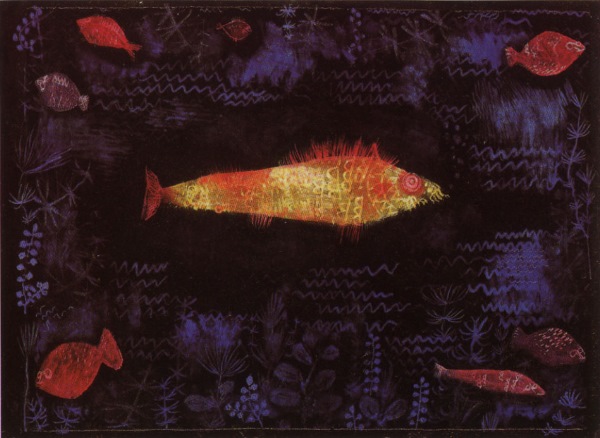
This piece is called The Goldfish 1879-1940 I like the sea illustrations around this piece because it makes me think and relate to how I produce my drawings I like the Goldfish because it shows colour relations to a literal Goldfish which I really like and also the black upon colour bring out the piece really well and shows the different sections of the sea of which fish can survive within the water and this is a good interpretation of this.
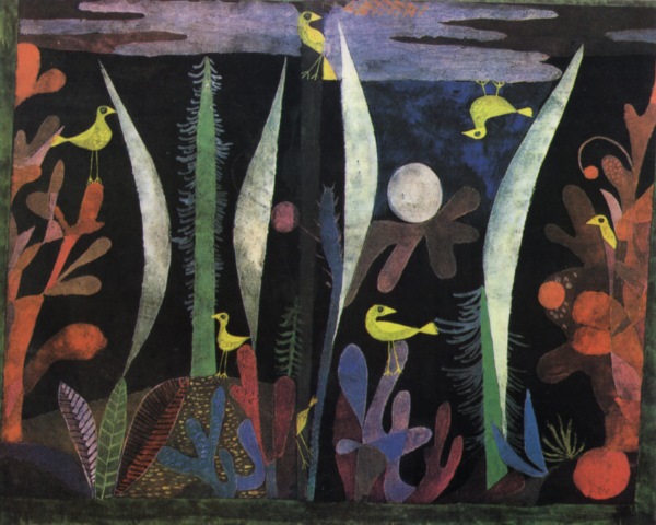
This piece is called Landscape with Yellow Birds I liked this piece very much because it shows my passion for nature and relation to my past and current project in ceramics. I like the sharp white shapes which represent sea plants and also liked the mixture of colours upon the black background and also how it breaks up everything with the subtle coloured shapes. I like the simplicity of the shapes and how it represents me as an Artist and Designer in the student world.
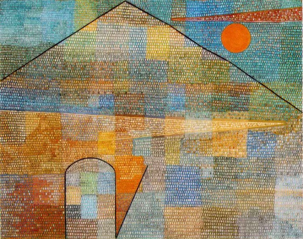
This piece is called Parnassum and it’s built in to a mosaic effect which I like and enjoy the different organisations of this I like the different and varied sections of colour and how you can see this in patches. I like the sunset this is a landscape piece but abstracted upon the mosaic effect I found this unique and also different from his other pieces of work.
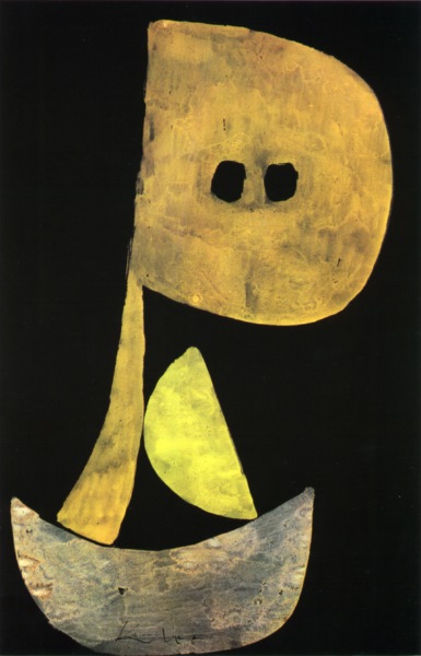
I like the contrast of colour and how it intermingles and works with this piece to make visually and aesthetically pleasing towards the eye. This piece above is called Stern Visage and it reminds me of a boat resembling a sail above it I like this piece.