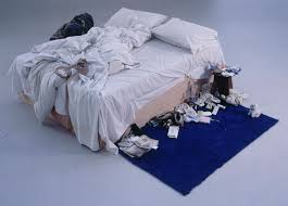
Tracey Emin: This image is by Tracey Emin called My Bed and it was produced after a breakdown she had it shows a ‘wild weekend’ of sex, dirty sheets, cigarette butts and knickers this is going in to the comparison of my Essay which forms around happiness of life and unhappiness of life. Showing the influences of being put down during her life in to creating this piece of artwork, this was first created in 1988 and was then exhibited in Tate Gallery in 1999 this consisted her bedroom objects as the abject state this gained a lot of media attention of the unpopularity of sex which then made the world think of how comfortable it was after this piece of artwork was released for public show. I liked this piece because it shows she isn’t scared of what to show about herself and she isn’t worried about what the world may think of her, it’s open and straight to the point and this is what attracted me to her work.
Louise Bourgeois: Red Room Parent and Child was a real eye opener for me as personal work goes, I liked this piece because it’s a document of her childhood life of being neglected and much unhappiness between her parents this installation piece had many aspects of what was not expected as a personal artist such as the installation piece with a pillow saying ‘I Love You’ on it which suggests much controversy of her childhood. It shows the main focus to be the bed in the parent’s room and also in the child’s room it shows red, red, and red! All over which shows no space, caged in.
Most of what happened with the main focus of the bed in the parents room is what happened in the parents bed such as rape of the mother by the farther this is very personal and something like this sticks forever but the clever thing about this is how it outlines importance to this installation piece. These two parallel installations work very well which each other as a comparison of unhappiness and broken home.


Ben Nicholson: Born in Denham, Buckinghamshire, first abstract painting; Chelsea produced 1923-4 Oil on paint and graphite on a canvas. I liked this piece because of the pattern composition and shape also the vivid colours used and the expression of the colour use, the shapes look like some form of landscape built upon sea which I liked and is part of a memory to me of landscape and coastal structuring. Below is the (White Relief Sculpture version 1). Plaster on a wooden base 1936 I liked this because of the use of sculpture and how he has used the impression and then then 3Dimensional elements to make this go in and come out which I thought was very creative.


This sculpture below by Ben Nicholson is called Circa 1936 painted wood I liked this because of the dimension, shape, simplicity of colour and how it looks so pure and just white and simple. The dimension to this and depth makes it stand out with the compositional factor of angles and corners.
Alfred Wallace:
This piece is called House at St Ives, Cornwall, 1928-42 I like this piece because of the simplicity of an observational drawing and how everything is flat and condensed I like the simple colours used and the repeated patterns which forms simple shapes of a house structure.

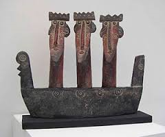
John Maltby: This piece interested me a lot because of the boat structure which almost looks Viking with figures which almost look like to be kings sat in a Viking boat in my opinion I liked this piece because it represents sea, coast, landscapes all in one this piece is called Royal Barge I like the rustic colours incorporated in to this piece to show tradition and historic natures to bring the realistic element of this to life! This piece is called King and Raven I liked this piece because of the connection with nature and also how this is sculpted and looks so realistic and precise. The downfall is the lack of colour because I’m massive on colour and brightness and this lacks it for me but apart from that I think it’s a lovely piece.
Winifred Nicholson:
This piece is beautiful, tranquil and calm and looks so relaxed and peaceful; this piece is called Sandpipers, Alnmouth 1933 I like the subtle realistic colours used on this piece and she is also related to Ben Nicholson so the talent does run in the family I like this landscape it’s somewhere you could just escape to!

Peter Lanyon: This piece to the left is simply basic but yet beautiful with the fluidity of line and how it just runs along this piece is called Drawing for ‘Orpheus’. Verso: Figure Drawing. I like the line structure and how it looks messy but yet straight to the point and slightly abstracted in a weird way. Lanyon is an English Painter and Sculptor and I like this is my favourite drawing by him.
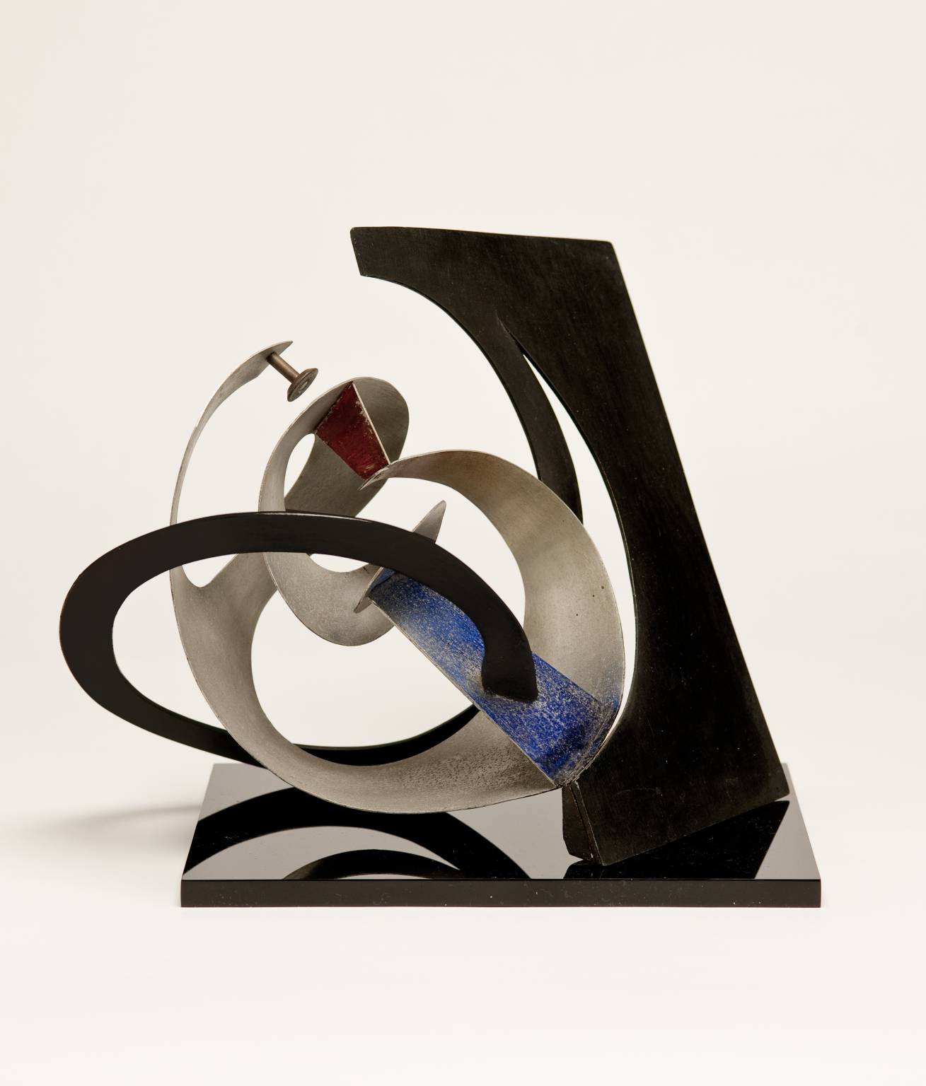
This fluidity of shape in this piece called Construction produced in 1947 made with Aluminium on Wood on a Perspex base. I like the mixture of neutral colours to this piece the shapes intertwined with the piece makes it stand out.